Styles, a feature of most desktop word processors, help you achieve consistent formatting throughout your document. For each paragraph, you simply indicate whether it is a heading, normal text, or some other type of content, and then you can separately change the formatting for all paragraphs with that style from the one place. Styles also indicate certain structural information about the document — for example, a word processor that knows which text corresponds to a heading can provide automatic numbering, a table of contents, and an outline view.
Despite the advantages of styles, many people don’t know how to use them, and end up wasting lots of time formatting their documents manually. Examples of this include selecting text and changing the font size to make it look like a heading, and directly entering in section numbers. This seems to work fine at first, until you have a 40 page document and decide you want to change all the headings to a different font size, or add another section near the start of your document. I once saw a PhD thesis whose author, who shall remain nameless, had constructed their table of contents manually.
For those of us who know how to use styles, or other structured authoring tools such as LaTeX, it can be tempting to simply blame the user for not spending time learning how to use their word processor. But I think the real fault lies in the user interface design of most word processors, which emphasise direct formatting over styles. As a result, many users do not even know that styles exist. I’m going to talk about Microsoft Word here, since it’s the most popular, but others based on similar designs — such as OpenOffice and Google Docs — deserve an equal share of the blame.
Let’s have a look at the user interface of Word 2011 for the Mac (click to enlarge):

Can you spot the problem here? The majority of the toolbar is devoted to direct formatting, and styles are presented as if they are a secondary option, rather than the default way of doing things. Many of the buttons on the left side of the toolbar are things that in a structured authoring process you would rarely, if ever, use. Styles are given only a small portion of the space, which sends the message that changing formatting details such as font, size, line spacing, and paragraph alignment is best done on a case-by-case basis.
You can’t see it in the screenshot, but there’s a button which lets you select from a more complete list of styles; it’s just invisible until you move your mouse over the area where the button is. If you resize the window to make it narrower, this area is collapsed to a single “Styles” button which, when clicked, brings up the list. This in itself is not a problem — the issue is that the direct formatting options are made a great deal more prominent than the style options, which means most people will naturally gravitate towards the former.
Contrast this with LyX, in which the first item in the toolbar is the current environment (LyX and LaTeX’s term for styles). Normally, this is “Standard” (corresponding to “Normal” in Word), but if you click on the toolbar item you get a list of common environments, as shown below:

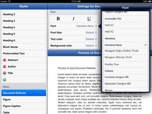
As with much of UX Write, the basic philosophy I’ve taken in designing the user interface is inspired by LyX, but adapted to suit the iPad. UX Write also supports direct formatting, but hides it one level back from the rest of the user interface. The screenshot below shows UX Write’s formatting menu on the left, and the direct formatting menu (which appears in place of the first menu when you select “Direct Formatting”) on the right:

The “Basic Formatting Options” and “Paragraph Style” sections of the formatting menu are intended to suffice for 98% of cases. The “More…” item expands the list with additional built-in styles, and also allows you to add your own custom styles. The “Edit Styles” button at the bottom of the popover brings up a full-screen style management interface, in which you can edit both built-in and custom styles. For the 2% of cases where you do actually have a need to set the formatting uniquely for one specific piece of text, you can do so using the direct formatting menu.
I’m hopeful that this will result in users finding it much easier to not only discover the concept of styles, but also make use of them. I think Word and its clones have their priorities the wrong way round in terms of formatting, and teach users bad habits which ultimately make it more difficult to work with large documents. The main downside to my approach is that it may initially be a turn-off for people who have become used to applying direct formatting everywhere — but hopefully this interface is clear enough to make it obvious that styles are the way to go.
I’m interested in feedback on this design – what do you think about it?