Daniel Hooper’s text selection concept video posted a couple of months ago received a tremendous amount of positive feedback from many tech blogs and readers. Like many others, I think it is a revolutionary idea for making text editing on the iPad a much more pleasant experience. Its main advantage, in my opinion, is that you can move around and select text without your hands needing to leave the keyboard. Another advantage is that when selecting text, you avoid the delay associated with the standard long-press gesture.
I’m happy to announce that I now have this mechanism fully implemented in version 1.0 of UX Write. The app just been submitted to Apple for approval and will hopefully be available on the app store fairly soon. I’ve done some things differently to Daniel’s original prototype, partly because of some implementation problems I ran into earlier, and also some usability suggestions I’ve had from others who’ve seen it.
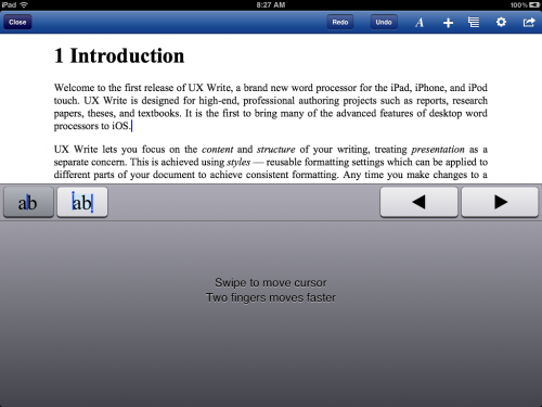
Rather than using a gesture over the normal keyboard to move the cursor, you need to first hold down the “move cursor” key (at the far left of the top keyboard row). This switches to a custom input view representing a virtual trackpad, which you can drag your fingers around. Dragging with one finger moves the cursor slowly, and dragging with two fingers moves the cursor faster, and snaps to the closest word boundary.
Next to the move key is the selection key, which works in a similar manner, but can be used to select text. You can toggle between movement and selection just by moving the finger that you used to press either key — this makes it easy to position the cursor at the start of a word and then subsequently select it. Also shown in the virtual trackpad view are left and right keys, which can be used for both movement and selection.
The reasons for using the virtual trackpad, rather than having the gestures be made just on top of the regular keyboard, are twofold:
- I found some cases in which my own gestures would conflict with behaviour that was built in to the system keyboard. One of these is where you can hold down certain keys to bring up a list of variations on the character — like ÿ and ŷ for the y key. Another case was with two-finger gestures, which were sometimes conflicting with the split keyboard gesture in which you drag two fingers in opposite directions to split the keyboard into two parts. Also, some keyboard types, like Chinese, allow you to draw characters by hand, and this wouldn’t have worked at all with the drag-to-move gesture.By using my own custom input view instead of the standard keyboard, I was able to completely avoid these conflicts, as well as conflicts with other system keyboard behaviour that Apple may choose to introduce in the future.
- Someone suggested to me that performing drag gestures over the keyboard felt unnatural, since it’s not something you would ever do on a physical keyboard. Everyone is familiar with the concept of a trackpad, so displaying the this instead makes it much more obvious what you’re supposed to do with it. The fact that this is triggered by the move and select keys, which are clearly visible in the top row of the keyboard, also makes it much easier for users who might not otherwise be aware of the feature to discover it.
Although Apple provides public APIs for implementing your own custom keyboard views and accessory views (the extra row of keys above the system keyboard), there is unfortunately no API support at present for replicating the appearance of standard system keys. To achieve a consistent look and feel, developers have to come up with their own custom mechanism for mimicking the appearance of the standard keys for their own additional keys. While this isn’t overly difficult, it would be good to see future versions of iOS expose an API for this purpose, since it’s something that a number of applications do.
I’ve actually come to form the opinion that extending the keyboard like this is actually an excellent way to provide quick access to program features that are useful during typing and editing. I have also added a set of formatting keys for changing basic formatting such as bold, italic, and list type, and have some ideas along similar lines for an equation editor. But these things will have to wait for another post…
Update: I’ve now posted a video of this in action: http://www.youtube.com/watch?v=SbVDk5qrR44


I like the Trackpad feature very much and would like to make a suggestion for the selection case:
split the trackpad in two halves, a top area and a bottom area. The top area moves the left pin (whose knob is at the top) and the bottom area moves the right pin (whose knob is at the bottom). Currently the Trackpad moves only one of the pins which requires me to place the other end exactly.