UX Write is no longer available

I’ve recently removed UX Write from the app store. Unfortunately it’s been a complete commercial failure. For the last two years, it’s been bringing in just a few dollars a day in revenue, which is nowhere near the level that would would make it viable for me to continue development work. Because of this, I’ve long-since moved on to other paying work, and have not had the time or energy to continue maintenance of the app.

There are two main reasons I’ve decided to remove it from availability now:

  1. Every new iOS version breaks the app in some significant way, requiring a non-trivial amount of effort to work around the new bugs/API changes Apple have introduced. iOS 10 is on the way, and Dropbox have recently announced they will be dropping support their version 1 API, which UX Write relies on. Unfortunately as a result of this, UX Write will be unable to communicate with Dropbox after their API sunset date of June 28 2017. Implementing support for the new API and carrying out thorough testing with iOS 10 would involve more effort than I’m willing to invest now, particularly since it’s not going to change the revenue situation.
  2. I still receive occasional support requests for the app, most of which relate to bugs that would require a significant amount of effort to fix. I also sometimes receive requests for new features. As much as I’d love to continue improving the app, I can’t do it for (essentially) free, particularly when experience has shown that it’s first and foremost marketing that determines the success of an app, and almost every feature I’ve added over the course of the UX Write’s development (such as internationalization and LaTeX support) has resulted in no increase in sales.

I know there are a small number of dedicated fans of the app who use it regularly, and all I can say is I’m sorry it hasn’t worked out – no-one is more disappointed about this than me. However, I feel it’s not fair to ask new users to pay for an app which is no longer being maintained, and contains bugs that will never be fixed.

There are other alternatives available that I recommend. Microsoft Word is a good choice for most people, and although I strongly dislike it’s philosophy towards document authoring, it seems to suit the needs of the majority of the market (most of the complaints I’ve received about UX Write have stemmed from a lack of understanding of what the app is about – that is, structured writing – from people who have expected it to work just like Word). For those who are after something specifically designed for structured writing, I recommend the recently-released iOS version of Scrivener – which follows a very similar approach to UX Write to organising content. On the desktop, either Scrivener or LyX are great choices.

Some time ago I open sourced some components of UX Write – specifically the file format conversion library (written in C) and core editing code (written in TypeScript) in what became the Corinthia project. The code is available at https://github.com/corinthia – it’s not actively maintained right now, but hopefully may be of use to someone. For details on Corinthia you can see a couple of talks I gave about it here and here.

Designing for mobile first

When I began developing UX Write, I never consciously thought about having to do anything “special” to get it running on mobile. Initially on Android, but after a short period moved to iOS, it began much like the development of any other mobile app  I just used the tools available to implement the functionality I needed. Specifically, these tools were:

  • A system-provided version of WebKit
  • Native support for parsing and rendering HTML
  • A JavaScript runtime environment with access to the DOM
  • System-provided APIs (UIKit) for building a native user interface

The result was something that felt like a native iPad app because it was a native iPad app. All of the toolbars, menus, and so forth utilised the built-in user interface components provided by the platform, and I tried to follow Apple’s iOS human interface guidelines as closely as possible. It just seemed like the natural thing to do.

Only after UX Write was on the app store did I start learning about other attempts to achieve the same end result but based on ports of existing desktop suites, such as Microsoft Office and OpenOffice. Most of these efforts fall into one of the following two categories:

  1. Remote access clients to a server-hosted version of a desktop office suite, basically using the iPad as a remote desktop or VNC client. Examples include CloudOn and Documents Unlimited.
  2. Native ports of a suite to mobile. These are much rarer; there’s an Android port of OpenOffice, and reportedly an in-progress port of LibreOffice as well. On Windows 8 tablets, such as the Surface, Microsoft made available a version of Office that was effectively identical to the desktop version, right down to the same menus, dialog boxes, and other UI elements.

Both approaches are fundamentally flawed.

The first requires a fast, reliable Internet connection, which even those of us who live in major metropolitan areas don’t have 24/7 (think traveling or going out). The second, as well as the first, squeezes far too much onto a tablet screen to provide something usable. Desktops and laptops have larger screens and more precise pointing devices (mice & trackpads), but the combination of a small screen and fat fingers does not lend itself to tiny little checkboxes, buttons, and scroll bars.

Remote access to OpenOffice on an iPad, complete with scroll bars, windows, and a mouse pointer

Remote access to OpenOffice from an iPad, complete with scroll bars, windows, and a mouse pointer (Documents Unlimited)

On mobile  especially on phones, but also tablets  you don’t have the luxury of being able to fill up the screen with innumerable buttons and other widgets. You must be judicious in your use of screen real-estate, and design an interface hierarchy that avoids unnecessary duplication and moves all but the most important options into sub-menus or alternate screens.

There’s a long tradition of mobile-first productivity apps that began well before the emergence of the iPad and Android tablets. Platforms like the PalmPilot, Windows CE, Symbian, and Blackberry all had various apps available for them which provided a subset of the functionality of their desktop counterparts. Notable among these were Documents to Go and QuickOffice, which both made it across from these more limited platforms to iOS and Android, though still retaining their fairly minimal feature set. Since the iPad appeared, a large collection of writing apps have followed in their footsteps  that is, being targeted at mobile, not desktops. UX Write is among this latter group, though closer to the desktop-level feature set than most others.

UX Write on iPad

UX Write on iPad

When Microsoft finally released Office for the iPad, they did something I didn’t think they were capable of: They actually started from scratch with a new UI implementation, completely abandoning the desktop interface present on Windows and the Mac. I specifically use the term implementation here, as the design is closely based on the ribbon used in the desktop versions Office, to provide a familiar experience. But by starting with a new implementation instead of trying to do what would have been terrible port, and by reusing the core rendering and file format support that make up the Mac version of Office, they ended up with a product that is actually pretty decent to use on mobile, though sadly some rather important capabilities like custom styles and tables of contents did not make it across.

As I look towards the future of UX Write, which most likely involves an expansion onto not just other mobile platforms but also desktop and web, I’ve gained an appreciation for the benefits that starting from scratch  and building an app in a flexible and portable way  can provide. The architecture of UX Write is such that there are several components that can be taken more or less verbatim and, with a few compatibility adjustments, made to work on other platforms. Each port needs it’s own distinct user interface design appropriate for the platform  the Mac version of UX Write I spent some time prototyping a while back provides a native OS X user interface, which is not the same as the iOS version. But the core code is able to remain the same.

As much as I’d like to claim I planned all this deliberately, I can’t  it’s simply a natural outcome of developing for mobile first, and keeping open the possibility of an Android port in addition to the current iOS version. After seeing the results of other efforts to take large, legacy codebases designed for desktop systems and bring them to mobile, I think I took the right approach.

I believe that the best way to future-proof an application is to build it in terms of a small number of core, portable libraries with minimal dependencies; then, for each platform, build a native application layer that ties them all together and follows the user interface conventions of the host platform. This leaves open the possibility of porting to other platforms (including other classes of platforms  desktop, mobile, and web) with less difficulty than with monolithic architectures. It also allows for the provision of a high-quality user experience that matches what users expect from a native app.

Announcing UX Write 2.0

After six months of work, it’s great to finally have version 2.0 of UX Write done. There’s some significant changes in this version, and most importantly, a new pricing model.

Try out UX Write for free

UX Write is now available via the “freemium” model. The basic edition, which can be downloaded for free, provides the core essentials – creating and editing HTML and Microsoft Word documents, syncing with various cloud services, and basic formatting like bold, italic, underline, lists, plus images and tables. It also includes heading styles and the outline view for navigating documents.

The professional edition, available via either a subscription or purchase option, has everything else. This includes custom styles and formatting, print/PDF export, structural features like a table of contents and cross-references, plus editing tools like find & replace, spell checking, outline editing, and word count (see the app website for full details).

You can upgrade to the professional edition via in-app purchase. There are two ways to go: you can buy the app straight out for $25, which is the same as the previous price. Alternatively – and this is what I recommend if you want to try it out for a while – is to subscribe at $1/month. Subscriptions are renewed manually, so you can decide at the end of the first month to extend your subscription or purchase the app if you feel it’s working well for you.

If you’ve bought UX Write prior to the release of 2.0, you automatically get access to the professional edition – there’s no extra payment required.

Updated look & feel

Version 2.0 introduces a brand-new visual appearance, courtesy of a new member of the team, Ian Weatherseed. Both of us have put a great deal of thought into how to best represent what the app is about, and how to make the overall experience more intuitive. Ian has a very different background to me – being much more oriented towards to the human rather than technical aspects of a product, and I’m pleased with the results of his work.

First of all is the new logo and icon, which unlike the old, skeuomorphic one, doesn’t appear completely out of place on an iOS 7 home screen:

UX Write 2.0 - Logo

Next is the colour scheme and background, which are designed to make the app stand out from the plain iOS 7 defaults. These were some difficult decisions, and I know it’s going to generate some controversy, but overall the feedback on it has been pretty good, though it might take a little getting used to.

The file manager has also been reorganised so that the set of storage locations (local storage and cloud services) is now on a separate screen to the folders where you store your files. This means less clutter when browsing a folder, and a more intuitive setup experience on first launch, where you start off with the following screen:

UX Write 2.0 - Locations

Google Drive and OneDrive support

Microsoft made a big splash with the introduction of Office for iPad, but unfortunately decided to only support their own cloud service, OneDrive. Google did the same thing when they bought QuickOffice, even going so far as to remove support for Dropbox.

UX Productivity is not in the cloud business and has no incentive to do something as dumb as this. I really don’t care what you use – the only limiting factor on the number of services supported by UX Write is the development effort required to support each one, as each has a different API and slightly different way of doing things. But I believe that choice is very important, so you’ve now got two extra options: Google Drive and OneDrive.

UX Write 2.0 - Google Drive & OneDrive

In fact, if you have all your files on, say, Dropbox or Box, and wanted to use them with Word on your iPad, you could download the free version of UX Write and use that to copy them across, and then switch over to Word to work on them. Or… you could just use UX Write itself 😉

Footnotes and Endnotes

By popular demand: You can now use footnotes and endnotes in your document. This has only become possible now because of the LaTeX support (see below) required to typeset them properly. HTML itself provides no way to place footnotes at the bottom of the page (since HTML has no concept of pagination), so they’re displayed in-line during editing, as shown below:

UX Write 2.0 - Footnotes and endnotes

If you typeset your document using LaTeX, then the print or PDF output will have the footnotes positioned correctly at the bottom, and the endnotes will appear at the end of the document. If the file you’ve created is in MS Word format, then they will also appear in the expected place when you view the document in Word.

Moving & copying files

I’ve written before about the complexities of moving files and folders in the context of file synchronisation. UX Write has been designed to work entirely offline, and there’s some rather obscure things that can go wrong if the same item gets moved around to different places on separate devices, and later synchronisation runs into conflicts – or, even worse – loss of data. This is the reason that moving and copying hasn’t been supported until now.

There’s been a lot of demand for these features though so I’ve now implemented them in such a way that avoids these problems by performing the operations synchronously. This means that in order to do a move or copy you have to be connected to the Internet at the time, and the app will send a request to the server to carry out the transfer, and force you to wait until it’s completed. This is a simple solution that avoids the risk of data loss, and I think will suffice in the vast majority of cases. Uploads still happen in the background as usual, and you can still do everything else offline.

UX Write 2.0 - Moving files

LaTeX typesetting

Finally – and this is a big one – UX Write now includes a built-in port of LaTeX (based on XeTeX) that runs directly under iOS. If you go into “Typesetting” under the settings menu and select LaTeX, then when you tell UX Write to print or generate a PDF, the app first translates the HTML representation of the current document into LaTeX source, and then runs that through LaTeX to produce a PDF:

LaTeX1000

While the current LaTeX support works for simple use cases, I still regard it in many respects as an experimental feature. There’s lot of aspects that I’ve yet to get working properly, including font support for non-English languages, plus import of files in .tex format – currently the LaTeX support is limited to PDF output only. As with everything else in UX Write, this is an evolving codebase that takes time to get right. In future updates, you’ll see support for equation editing, BibTeX, importing files, extra page layout options, and more.

Try it out today

With the new basic edition now available for free, there’s no longer any reason not to give UX Write a try. If you’re new to the app, you’ll be able to get a pretty good understanding of what it’s like to use, and there’s no time limits or third-party advertising there to annoy you. The only difference between the two editions is the set of features available. And if you do decide to try out the professional edition, you can sign up for a month and see how you go, before deciding if you want to continue subscribing or purchase the app.

Download on the App Store now

Coming soon: LaTeX support

The most important new feature in the upcoming UX Write 2.0 release is support for typesetting your documents using LaTeX. It’s been a major effort to implement this, and the full benefits will take some time to materialise (see below). Nonetheless, this sets the stage for a lot of great new features important for academic and technical writing, which will be added in subsequent 2.x releases.

I’m looking for beta testers for this release; if you’re interested, let me know.

What is LaTeX?

LaTeX is a file format and typesetting system designed for producing high-quality print output suitable for publication in books and academic journals. The file format is similar in nature to HTML; it can either be written by hand, or exported from a visual editor such as LyX. The typesetting system is based on TeX, which implements sophisticated typography including hyphenation, ligatures, and kerning, as well as beautifully-rendered mathematical equations. The result is print and PDF output that looks just great.

LaTeX has been the de-facto standard in many scientific and technical disciplines for decades. In the business world however, it’s not so well-known. But like switching from Windows to a Mac, or from working an office job to being a digital nomad, there’s just no going back once you come to appreciate the benefits. I’ve used LyX and LaTeX for my PhD thesis and all of my research papers, and like most people in my field, would never even contemplate anything else for a formal publication.

LaTeX comes to UX Write

From the very beginning, the design of UX Write has been driven by my desire to have something like LyX on the iPad. As much as I like the output of LaTeX, I don’t like writing the markup by hand; I find it much less distracting to have a visual editor where I can see headings, lists, bold/italics and so forth without special syntax. LyX does this on the desktop, exporting to LaTeX and producing a PDF identical to what you would get if you’d written the LaTeX source in a text editor. I’ve always wanted this same functionality in UX Write, but like most features, it involves an incredible amount of time and effort to implement.

Finally, after months of work, I now have a functioning port of LaTeX running under iOS, and integrated directly into UX Write. I’ll discuss the challenges I had to overcome to get this working in another post, but for now the key point is that this will be included in the upcoming 2.0 release.

First successful on-device typesetting run

The first successful on-device typesetting run

Why is this important?

Even if you’ve never heard of LaTeX before or aren’t obsessed with typography, this work is a huge step forward for UX Write because it lays the groundwork for many features people have been asking for but I haven’t been able to provide with the current WebKit-based PDF output. These include:

  • Footnotes
  • Headers and footers
  • Page breaks
  • Custom page layout
  • Cross-references to specific page numbers
  • Bibliography and citations

To be clear — these features won’t be in 2.0: the LaTeX integration has only been working for a few weeks, and I have a great deal more work to do in order to add all this functionality to the editor and convert these elements from the HTML (used internally by UX Write) to LaTeX syntax. And for the time being at least, LaTeX support will be export-only; parsing and conversion to HTML for editing is whole other story.

However, the hard part is now done, and you can expect to see these features gradually appearing in updates throughout the 2.x release cycle. In the initial 2.0 release (which will be a free update for all existing users) you’ll be able to get LaTeX typesetting with basic formatting for English documents, both when printing and exporting to PDF.

Tabs and multiple spaces

I often get questions about why UX Write doesn’t allow you to insert tabs into a document, or place multiple spaces after a period. Some people have also asked about why existing tabs in a Word document show up as a grey [tab] marker. In this post I’m going to explain why this is.

UX Write uses HTML – the language of the web – for displaying and editing documents. When you open and save a Word document, UX Write converts it to HTML and back again. The HTML content is displayed on screen using a software component called WebKit, which is the same layout engine as used by Safari (and formerly Chrome). Every document you edit in UX Write is quite literally a web page; the only difference with a web browser is that your document is stored locally on your device, not published online.

HTML provides a slightly different set of layout features to Word. While most features can be converted back and forth without problems, there are some features present only in HTML, and some present only in Word. Thus, UX Write can never provide a 100% faithful rendering of all Word documents, and doing so has never been a design goal.

I chose HTML partly because it’s so widely used – as the foundation of the web – and partly because it enabled me to use an existing layout engine, rather than spend years writing my own. HTML is also much better designed than Word, and with a minimal amount of training a person can reasonably read and write HTML code directly. This is not the case with Word documents.

Tabs

HTML doesn’t support tabs. There’re simply not used not the web.

While I’m not sure of the exact rationale for the W3C (who designed HTML) to exclude tab support, I suspect the reason is because it’s unnecessary, in the sense that everything you can achieve with tabs you can also achieve without.

There are two main use cases I’m aware of:

1. Paragraph indentation. This can be achieved in both HTML and Word by changing either the left margin or text indent formatting properties of the paragraph or style.

In UX Write, go into the formatting menu and then either direct formatting or the style manager, and set these as appropriate. I recommend creating a style for the indented paragraph, so that you can do this again easily by selecting the style from the formatting menu, and later adjust the amount of indentation if you so wish.

2. Tabular data. This can be achieved in both HTML and Word by using tables, either with or without a border. Instead of adjusting tab stops, you adjust column widths. Instead of setting the alignment of a tab stop, you set the alignment of a table cell or column.

Even better, with tables it’s possible to create a custom style that defines the horizontal alignment, vertical alignment, and border appearance once and then use this for all tables in your document, so you don’t have to go formatting each manually.

Unfortunately UX Write doesn’t support customising table formatting at present, but this is coming in the near future. However, any customisations you make in Word will be retained by UX Write. I’m also considering providing the ability to convert tabs to a combination of indented paragraphs and tables when the app encounters a document containing these, so you don’t have to do so manually.

Multiple spaces after a period

By default, HTML collapses all whitespace in the source file, which means that any consecutive sequence of one or more spaces or newline characters in the HTML code is displayed on-screen in the same way as if there were a single space. If you view the source of a HTML document, you’ll typically see that a single paragraph is actually spread over multiple lines, e.g.:

<p>Here is a HTML paragraph. Its
content spans multiple lines in
the source file, for convenience of
editing in a text editor, but the
author's intention is to have it
displayed using word-wrapping according
to the user's browser window size.</p>

In a sense, HTML considers a sequence of space and newline characters simply as an instruction: “Don’t put the surrounding characters next to each other”. In fact, if you use justified text, the amount of space between different words will vary, as the layout engine will space the words out appropriately to ensure that both the left and right edges of all lines except the last line up with the left and right margins. In HTML, and most other file formats, spaces are not a fixed width character, and two spaces are considered no different than one.

While I’m aware of the controversy surrounding the “one space or two after a period” debate, I think it’s a pointless one. This problem was already solved more than 30 years ago by Donald Knuth when he created TeX, which automatically adds a small amount of additional whitespace between sentences, and gives higher priority to inter-sentence spacing than to inter-word spacing when it needs to stretch out a line when performing justification. If you really care about typography this much, you’ll already be using a system like TeX or LaTeX to prepare your final publication-ready output. The image below shows the same two sentences as typeset by LaTeX, Safari, and Microsoft Word; in all three cases, the text was entered with only a single space after the period.

Sentence spacing

The good news is that built-in LaTeX typesetting is coming to UX Write in the very near future. Most of my development effort over the past couple of months has been in porting LaTeX to the iPad, and when this work is complete you’ll be able to take advantage of the beautiful typographic output it produces when printing or generating PDF files, producing much more professional-looking results than is possible with Word. Stay tuned for more on this.

Why does typing two spaces insert a period?

The iOS text entry system has a built-in feature, which I believe is on by default, that allows you to type two spaces in succession to get a period, as a shortcut mechanism. This is an option which can be configured under the in the Settings app, under General > Keyboard > “.” Shortcut:

Period shortcut

While you can turn this off on a system-wide basis, the setting only applies to apps which use Apple’s built-in text entry mechanism (which most do). However, for apps like UX Write that provide their own text input handling, changing the setting has no effect. Unfortunately, to the best of my knowledge Apple do not provide any mechanism by which apps can determine whether this setting is on or off, so it’s not possible to automatically adjust the input behaviour based on this.

UX Write re-implements this feature itself, to match the behaviour seen in other apps when the setting is on. Before I implemented this, I received a number of complaints about the fact that it didn’t add the period after pressing two spaces, which is why I added support for it. Since then, I’ve received only a handful of complaints about the fact that it does add a period, so of the two options I’ve concluded that it’s better to have it on. This also seems to make sense given what I’ve discussed above about the inability (and pointlessness) of typing multiple spaces manually in a document.

Understanding Layout in UX Write

I sometimes get questions from people asking why some particular layout-related aspect of UX Write doesn’t work the same way as in Microsoft Word or Pages. The answers all invariably come down differences in the approaches these programs take to layout — that is, the way in which they display the text you’ve entered on screen, and the level of control given to you over how this layout is done. Because UX Write is based on Safari’s layout engine, its capabilities depend entirely on what is possible to do on a web page, which excludes certain features like tabs, page breaks, footnotes [1], and columns [2].

Microsoft Word, OpenOffice Writer, and Pages are all based around the idea of WYSIWYG (What You See Is What You Get). This is a visual approach to writing, where the position of text and other elements in the document is remains unchanged regardless of how you are viewing the document, whether on-screen or in print. This model is appropriate for people who need precise control over exactly how their final published document will look, and want to have that layout control combined with text editing facilities in the same program. If you have these needs, then UX Write is not a good choice for you as it specifically does not attempt to provide a fixed layout, for reasons I’ve written about previously.

UX Write, HTML, Markdown, LaTeX, and LyX are based around the idea of WYSIWYM (What You See Is What You Mean). This is a structural approach to writing, where you add text, sections, subsections etc. in an abstract manner, and the way in which they are actually displayed depends on the circumstances in which the document is being viewed. Often referred to as the separation of content and presentation, this model is appropriate for people who care only about the content of their writing, and are happy for the presentation to be tailored to suit the output device (tablet, phone, desktop, print), subject to some level of customisation (such as fonts and colours) defined in a stylesheet. If you have these needs, UX Write is really your only choice on the iPad right now — I’ve still yet to see another app which properly supports even styles, not to mention automatic numbering, table of contents generation, and other features that depend on structural information.

You use this latter model every day when you browse the web. Well-designed websites [3] will wrap their content to the width of your browser window or your phone/tablet screen, and this will change as you resize your window or rotate your device between portrait and landscape. On some desktop browsers, you can also change the font size to what is most comfortable for you to read. E-book software like iBooks and Kindle also follows this model. If you’ve ever tried to read a PDF document formatted for a full-size A4 page on your iPhone or iPad mini, you’ll undoubtedly have been frustrated by the small text and excessive scrolling; reflowable text avoids this.

Neither the visual or structural approaches are inherently “right” or “wrong” — everyone has different needs, and you should pick the app that’s right for you. UX Write is very much built around the structural approach, because it’s intended for long-form technical and academic writing, though is useful in many other contexts as well.

I realise now that the current messaging on the app’s website is too ambiguous — it compares UX Write to Pages, which I now think is a pointless comparison given that they’re designed for different types of users. I’ve actually found it quite a challenging task to communicate what UX Write is to an audience unfamiliar with the structural writing approach, and the app often gets judged badly when measured on those grounds. As part of a larger rebranding exercise I’m working on with a colleague of mine, I plan to redo the website to try and clarify the app’s focus on technical and academic writing, and make the differences from visually-oriented word processors clearer.

[1] Though they can be “faked”, like this

[2] Columns have actually been added recently to the web standards, but without pagination, placing an entire document in columns would cause the second column to start half-way through the document. The reader would need to scroll down the entire first column, then right back up to the top, before they can read the second column. That’s not good.

[3] And I don’t consider this blog particularly well-designed, though the latest WordPress update does seem to finally implement text wrapping when you resize the window, and it’s readable on an iPhone without zooming.

Content, Structure, and Presentation

UX Write is designed around three primary aspects of electronic documents: content, structure, and presentation. To appreciate how and why the app works the way it does, it’s important to understand each of these aspects and how they relate to each other:

  • Content is simply the words and images in your document — nothing more, nothing less. It is the most important aspect, because it contains the primary value — your idea, your story, your message; whatever information you intend to convey to the reader.
  • Structure is the way in which your document is organised. Typically this involves a hierarchy of sections with one or more levels of headings, as well as the arrangement of content into paragraphs, lists, tables, and figures. Any special designation attached to certain paragraphs, such as the document title or a footnote, is also considered structure.
  • Presentation is what your document looks like. It is determined by formatting and layout options such as fonts, colours, margins, and line spacing. These options are either set on a case-by-case basis via direct formatting, or, preferably, using styles to specify how headings, normal paragraphs, and other structural elements should appear.

All three of these are critical aspects of any professional documentation tool; when tied together, they permit the automation of many editing and publishing tasks. Structural information, in particular, is necessary for generating a table of contents, numbering headings, figures, and tables, supplying the text of cross-references, and providing navigational aids during editing such as an outline view. Furthermore, the use of styles enables the presentation to be based on the structure, so a consistent visual design can be reliably maintained throughout the whole document without manual effort.

Word processors vary greatly in their support for the structural aspects of editing. Some provide none at all — requiring all presentation to be specified via direct formatting, which makes it difficult to achieve a consistent look and feel or conform to organisational style guides. Others provide very basic facilities, such as lists and tables, but little else. The most capable provide full support for all aspects of structure, such as headings, built-in and custom styles, automatic numbering, and table of contents generation.

Even when a word processor supports advanced features, they are not always obvious from the user interface, and are only revealed in their full glory after you’ve climbed a steep learning curve. The canonical example is Microsoft Word, which has hundreds of features hidden away in various menus and dialog boxes, but has a default toolbar configuration which encourages bad practices like direct formatting, as I discussed in a previous post.

UX Write is designed first and foremost for structured writing, with the hierarchical organisation of sections made explicit, and direct formatting deliberately discouraged in favour of styles. This is why it feels so different to use than Word — it’s a cleaner, more disciplined approach to document authoring, which is optimised for writing, with presentation as a secondary concern. The focus is on helping you with your most important task — getting your message across.

iOS 7 Update and New Features

iOS 7 has finally been released today, and with it the first set of apps updated for the new version of the platform. Among them is a major new release of UX Write, which addresses language support, and adds several important new editing features. UX Write 1.2 requires iOS 7, and will run on the iPad 2 or later, iPad mini, and iPhone 4 or later.

Here’s what’s new:

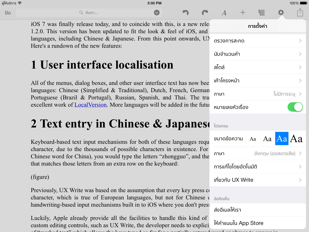
User Interface Localisation

All menus, dialog boxes, and other user interface text have now been translated into the following languages: Chinese (Simplified/Traditional), Dutch, French, German, Italian, Japanese, Korean, Portuguese (Brazil/Portugal), Russian, Spanish, and Thai. The translations are thanks to the excellent work of LocalVersion. More languages will be added in the future.

UX Write in Thai

Text Entry in Chinese & Japanese

Keyboard-based text input mechanisms for east-asian languages require multiple key presses per character, due to the existence of many thousands of possible characters. For example, to type 中国 (the Chinese word for China), you would type the letters “zhongguo”, and then select from a list of candidate words from an extra row on the keyboard.

Chinese text input

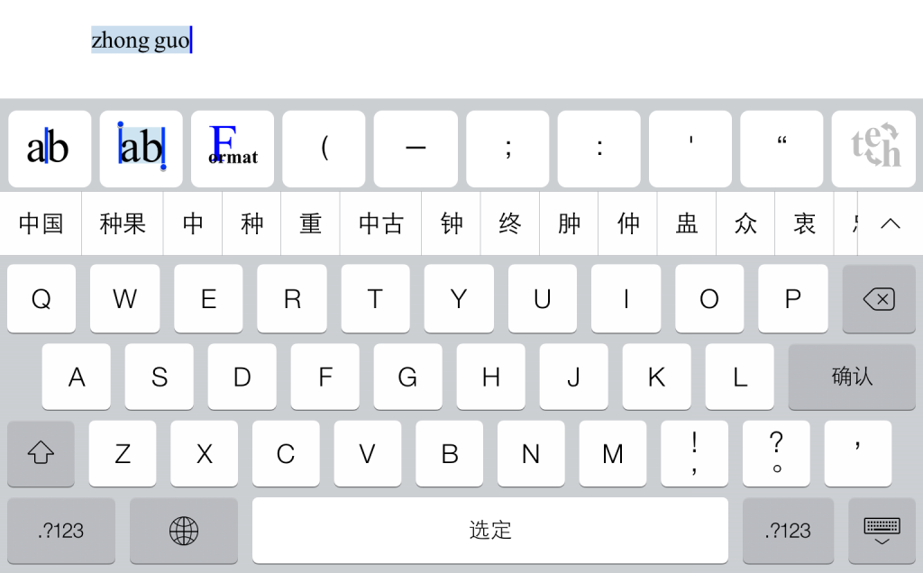
Previously, UX Write operated under the assumption that every key press corresponded to an individual character, which is true of European languages, but not of Chinese or Japanese. There are also handwriting-based input mechanisms for these languages built in to iOS where you don’t press keys at all.

Luckily, Apple already provide all of the keyboard logic for taking this kind of input from the user, including the word choice mechanism described above. However, apps like UX Write which use custom text editing components have to explicitly cooperate with this logic by supporting so-called “marked text”, which is the sequence of letters that has been typed by the user, but is “provisional” in the sense that it will later become a different sequence of characters when you finally choose a word. It was this relatively small piece logic that UX Write was missing, and now that I’ve added support for this, the key-based and handwriting-based input mechanisms for Chinese and Japanese now work.

Find & Replace

You wanted it, you’ve got it. This has been the most requested feature of all over the past few months, and is finally in. You know that empty space at the top of the toolbar where other apps put direct formatting properties like font size and paragraph alignment that really belong in styles? I’ve used that space instead for a search bar — just like you have in Safari. Just tap on it and type in your search term. On the iPhone, it is accessible under the Settings menu.

Find and replace

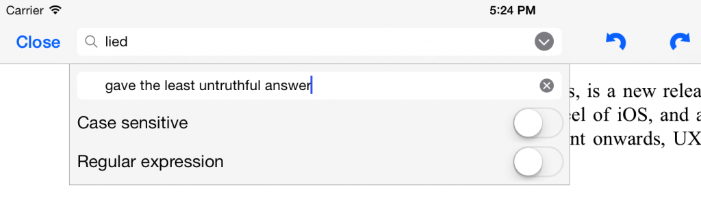
If you tap the little arrow icon next to this bar, you’ll get some additional options. You can use these for find & replace (as opposed to just find), specifying whether to perform a case-sensitive or case-insensitive search, and also searching based on regular expressions. [see note at end of this post about a replace bug for which a fix will be available in a few days]

Regular expressions, if you haven’t encountered them before, are a way of specifying patterns of text that you want to match, rather than an exact match of a particular word or phrase. UX Write supports regular expressions in both the search text and the replacement text. If you’re an old-school Unix hacker you’ll be familiar with the concept; otherwise, you can learn about them here. UX Write’s regular expression support uses the NSRegularExpression class that is part of iOS; you can see the details in all their glory on Apple’s developer site.

One suggestion a beta tester made to me was offering a “whole words only” option for find & replace. I’ll be providing this in a future update.

Spell Check

Another often-requested feature, this is now available as well. You can access it from the Settings menu, and it will highlight any words it finds that aren’t in the dictionary. The user interface for correcting a word is the same as what you use for autocorrect — you can select from a list of alternatives, or add it to the custom dictionary (which can also be edited through the Settings menu).

One caveat with spell checking in UX Write is that it only works with languages for which Apple provides a built-in dictionary. These languages are: Danish, Dutch, English, French, German, Italian, Portuguese, Russian, Spanish, and Swedish. If Apple later start including dictionaries for other languages, then these will be automatically supported for spell checking and autocorrect purposes by UX Write.

Word Count

There’s not really much to say about this I guess other than yep, it’s there.

I did find out however rather late in the piece that Japanese is written without spaces between words, and I’ve been told that in Chinese spaces are often omitted as well. Thai is the same; I’m actually studying Thai at the moment and while the books we’re using in class use spaces between words to help us comprehend sentences more easily, this is not done for mainstream Thai writing.

So for now at least, word count only works properly for languages in which words are separated by spaces. However, it does also show the total number of characters and paragraphs in the document as well, so if either of those is what you’re after, you can get them as well. I’ll be adding an extra item for character count excluding spaces in a future update.

iOS 7

The release of iOS 7 is one of the most significant in the platform’s history, after the introduction of third-party apps in 2008, and multitasking in 2010. While on the outside there’s a complete visual refresh, there’s also a lot of new features “under the hood” that I’ll be taking advantage of in future versions of UX Write.

One of those in particular is real-time pagination in WebKit, which will allow me to provide an option in UX Write that will show you where page breaks will occur in the printed document. A lot of people coming from an MS Word background have been asking for this, but I haven’t been able to provide it to date due to limitations in WebKit. Unfortunately, the pagination support in the initial release of iOS 7 doesn’t work correctly, so I have to wait for Apple to fix the bugs I’ve reported before I can make use of it in UX Write.

Other new features I plan to utilise include improved background file transfer, AirDrop support, and CSS regions (enabling magazine-style page layout). I’ve really only scratched the surface of what iOS 7 has to offer at this stage, because all the beta versions of 1.2 had to be compatible with iOS 6 as very few of my beta testers have developer accounts.

Now that iOS 7 is available to the public however, new releases of UX Write from now onwards will depend on it. While I’ve been reluctant to drop support for older versions — particularly because iOS 7 won’t run on the original iPad — I’ve concluded that the effort required to support both is too much to be worth it, and I’m better off putting my time into adding new features. If you have an iPad 2 or later (including iPad mini), or an iPhone 4 or later, you can update to iOS 7 for free.

Known Issues

There’s been a lot of “behind the scenes” changes in the UX Write codebase for this version which won’t be readily apparent to you as a user, but have increased the risk of bugs in this version. It’s had a fair amount of testing while in beta, however there are several issues that have come up since I submitted 1.2.0 to the app store a week ago:

  • When opening an existing Word document that doesn’t already contain heading styles, these will not show up in the formatting menu. If you encounter this problem, open up the document in Word, mark one or more paragraphs using the heading styles you want, and then take the document back to UX Write.
  • The external keyboard is not recognised in some cases. If this happens, just tap on the screen and this should get it to recognise the keyboard.
  • The replace field doesn’t work on the iPad. Currently there’s no workaround for this; it only works on the iPhone. Yes, this is a bit embarrassing.

I’ve already fixed all three of these bugs (plus a few others) and submitted a 1.2.1 update to Apple. It should be approved for release in the next few days. Do let me know if you find any other problems.

Update (19 September): Apple approved the 1.2.1 update in just over 24 hours. Normally it takes 4-5 days; I’m impressed!

Pirated copies of UX Write on the App Store

Over the last couple of weeks I’ve been dealing with a very frustrating problem. I’ve become aware of three different instances in which unauthorised, repackaged copies of UX Write have been submitted to and approved for sale on the app store, each under a different name. I’ve been going through the standard process to pursue these cases, but decided to post here as well, to clarify that these copies are not legitimate versions. The genuine version of UX Write is available on the app store here.

The unauthorised versions are as follows:

All three are verbatim copies of UX Write version 1.1.4, with only the name and icon changed. The Getting Started guide has been modified to use the name “Document Master”, even in the case of the last two apps. The screenshots on the app store are completely inaccurate and the descriptions highly misleading, in many cases listing features the app does not actually provide.

The only reason I even became aware of these is because the people who did the repackaging made a certain mistake (the details of which I won’t go into) which results in the app crashing under certain circumstances, where the original does not. Since the actual program itself is unmodified, it still uses my email address as the destination for all user-submitted bug reports and feedback. I’ve received emails about these from more than 200 people so far, none of whom initially realised that what they’d purchased was an unauthorised copy.

Piracy is a fact of life in the software industry and ultimately there’s nothing you can do to stop it. It would not surprise me one bit to see copies of UX Write on the Pirate Bay or other sites that have apps for downloading to jailbroken devices. But the app store is different – it’s run by Apple, who review every submission to ensure it complies with their rules, and once approved, they earn a 30% cut of every sale. So while I wouldn’t even bother spending time trying to deal with copies posted on torrent sites or similar, the nature of the app store is such that I think it’s reasonable to expect a higher standard from it.

The last time something like this happened, Apple refused to do anything about it and told me I had to deal with it myself. I made it clear to them that I’m expecting a better answer this time, and the people I spoke to were very understanding and I’m hopeful they will eventually remove the apps. After all, telling developers such as myself to email the people selling pirated copies to ask if they’d please stop doing so is not, in my opinion, a viable solution. There’s nothing to stop the other party from ignoring emails, refusing to take their copies down, or simply doing so but then resubmitting with a new account and a different name.

I don’t directly blame the reviewers for approving these copies in the first place – there are hundreds of thousands of apps out there and it must be huge task to manage it all. But the process is clearly broken, and needs to be fixed. I’m due to attend WWDC in a couple of weeks and hope to have the opportunity there to speak with people from Apple about the issue and how the situation could be improved. I’m far from the only developer affected by this problem – in checking for other copies of UX Write, I’ve found many other instances of apps from other companies being repackaged and approved as well; it’s clearly a widespread problem.

Using Box with UX Write

The latest update to UX Write, version 1.1.6, has just gone live on the app store. This introduces integration with the native Box app for the iPad, which provides an alternative to UX Write’s own built-in file management and syncing capabilities.

One of the biggest problems with the iPad for content creation tasks is the lack of built-in file management capabilities. Despite these being present on every major desktop operating system for the past 30 years and a critical component of almost all professional workflows, the iPad itself does a very poor job of catering to these needs. Thus, it is left up to third-party developers to implement their own file management and syncing solutions, which is a huge time sink that takes away time from working on core app features. Thus I’m always happy to see apps & SDKs which make this process easier.

Box is an online storage service (similar to Dropbox and Google Drive) and has client apps for the iPad, iPhone, Android, Mac, and Windows. A critical and unique feature of the native iPad app is it contains facilities that allow both opening and saving of files with other apps. While the iPad has a built-in “Open in” feature (supported in many apps) which let you send a document one way, there’s usually no way to get it back. Box provides an SDK that individual app developers can use to provide the ability for you to save a document back to Box once you’ve modified it. This is a critical piece of the puzzle that is missing from other solutions that I’m aware of.

Using Box with UX Write

Once you have an account with Box (which you can register for free) and install the Box app, here’s what you’ll see:

Box - Main screen

To create a new document, click on the cloud ‘+’ button in either the top-right or bottom-left corner of the screen. Then select the app (UX Write), and the file type (e.g. DOCX):

Box - Create document

This will bring up UX Write, and you can start adding text to your document. When you’re done, tap on “Close” and then “Save to Box”:

Box - Save

This will switch to the Box app, which will prompt you to type in a name for the document. When you’re done, press upload.

Box - Upload

And that’s it! You can now have your document synced with other devices and computers that you’ve installed the Box client on. You can also view and edit the document in any other Box-compatible apps you have installed:

Box - View & edit