
The basic design of modern word processors has its roots in the WYSIWYG (“what you see is what you get”) revolution of the 1980s, which became possible with the introduction of the graphical user interface. Whereas people once had to use a text editor to enter markup by hand, and never really knew what their document was going to look like to readers until they printed it, WYSIWYG provided an accurate on-screen depiction of how the final print output would appear.
For most of the history of personal computing, documents have been written for print. Even when they were viewed on a desktop or laptop, the screen was always large enough to display either the whole page — or at least the full width of the page, with the possibility to scroll vertically. However in the last few years we’ve witnessed an incredible shift in the way people consume content — e-readers and tablets are now widely used by people for reading books, papers, and notes.
Because devices like the iPad, Kindle, and Android tablets have screens that are smaller than a typical printed page — particularly in the case of 7″ tablets — it’s necessary for software that displays documents to take a different approach to layout than what has traditionally been used. Whereas in a Microsoft Word document or a PDF file you have a fixed page layout where the placement of text on a page is predictable, e-book readers instead use a reflowable layout in which the text is adjusted to suit the screen size, orientation, and user preferences. If you’re writing an e-book, you can’t rely on the assumption that page breaks will occur in particular places, since this will be different for every reader. In other words, what you see is not what you get.
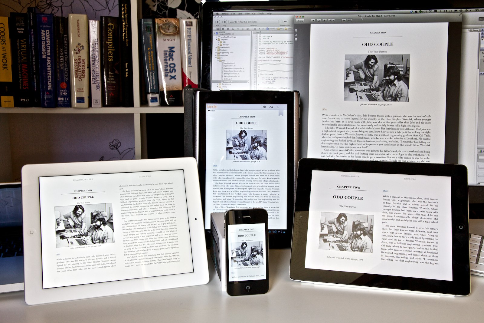
If you look closely at the picture above (click to see full-size), you’ll notice that the page being displayed is different on every device. My Macbook Pro, with a 24″ external monitor, has lots of screen real estate available and can thus fit a lot more text on the page than any of the other devices. The two iPads are both displaying the same page, but because the one on the right has a non-retina display, I’m using a larger font than on the retina iPad on the left, for legibility — meaning less text fits on the screen. The Android tablet (sorry Steve) has different dimensions and is in portrait mode, while the iPhone’s screen is so small that it only has room for the picture plus two lines of text.
On every device, the book has a different number of pages. And neither has the same number of pages as the print version.
Reflowable Content and Editing
The new reality of multi-format publishing we find ourselves in demands a different approach to document editing than was the norm during the print-only era of the 1980s and much of the 1990s. This has actually been a long time coming — the web ushered in the first major platform for viewing reflowable content, with most early web pages readily adapting to whatever size your browser window was. However graphic designers schooled in the print mindset soon came along and changed that, forcing every website into a fixed-width layout.
This worked fine for quite a while, as pretty much everyone’s computer screens were large enough to display these pages, but mobile browsing sucked for a very long time until Apple finally came along with the iPhone and Mobile Safari, with its zoom feature. For many websites however, this didn’t fully solve the problem, as although you could zoom in and out, you often had to repeatedly scroll left and right as you read through a paragraph, because some web designer had decided that their layout looked best at 1024×768, and forced the text to be that wide. The web design community realised this problem fairly quickly and started adapting their sites to either serve up a different layout to mobile devices, or use a reflowable layout that results in a good-looking document regardless of the screen size.
So if you’re designing a word processor in the early 2010s which has to run on the iPad, iPhone, and now the iPad mini, do you use fixed layout, or reflowable layout?
Based on what I’ve discussed above, the answer might seem pretty obvious, but it’s actually a bit more nuanced than that. Many people are used to the fixed layout of Microsoft Word and similar programs, and there’s a lot of established practice about the way in which formatting is done — such as entering in a series of blank lines to cause text to appear at the start of the next page, tabs to indent text to a specific width, placement of images relative to the top or bottom of the page, etc. These things don’t translate well into reflowable layout where the width of a page, and the location of page breaks (if they exist at all, which they don’t on the web) can differ between devices, and even on the same device if the user rotates it or changes their preferred text size.
There’s an inherent conflict between the goals of achieving full compatibility with the way in which desktop word processors are often used, and what works well on a tablet. Some apps have opted to simply copy the pure WYSIWYG model — dividing documents into fixed-size pages, always using a fixed width and providing a zoom feature so you can enlarge the text. While this makes it possible (in principle at least) to maintain the exact same formatting as you would see in Word, it causes lots of usability problems on small screens, particularly with the iPad mini and iPhone.
Trade-offs
There’s no ideal solution to this dilemma — it’s necessary to either provide a fixed layout, and try to preserve the exact placement of everything as it will appear in print on the small screen, or to use a reflowable layout, where the text and images are adapted to be readable on the small screen. Both approaches involve trade-offs, and which one is best depends very much on what the user’s primary goal is — layout or writing.
In designing UX Write, I decided to go with the reflowable option, because I think that of the two, it provides the best user experience on a small screen. This is also based on the assumption that the primary interest of people who use the app is their content, rather than how it looks. Of course this assumption doesn’t hold for everybody — depending on your needs, you may need finer control over layout and want to see an exact print-like representation of your document during editing. However UX Write does provide a print preview option (it’s called “Generate PDF” — they’re one and the same), so it is still possible to get this view, just not in real time.
As with many design decisions that have to be made with an app like this, things like layout approaches and file format support involve trade-offs. Different developers will make different choices on these issues based on the sort use cases they’re targeting with their app, and at the end of the day from a user’s perspective it’s necessary to choose the right tool for the job. In the case of UX Write, my goal has been to cater for multi-format publishing, where the separation between content and presentation is a necessary aspect, and to provide the best possible user experience for writing on mobile devices.
Pingback: *“A man becomes preeminent, he’s expected to have enthusiasms.”* | Edmonds Forum
Pingback: Edmonds Forum
Pingback: Links 1/4/2013: April First Headlines and More | Techrights
As with faxing, the importance of printing is diminishing, rapidly, so you made a decision that works better for the future rather than for the past. What’s special about UX Write is that, while it forego page-breaks and graphics placement for print, it does text WYSIWYG, which makes editing easier than when using mark-up.