Tabs and multiple spaces

I often get questions about why UX Write doesn’t allow you to insert tabs into a document, or place multiple spaces after a period. Some people have also asked about why existing tabs in a Word document show up as a grey [tab] marker. In this post I’m going to explain why this is.

UX Write uses HTML – the language of the web – for displaying and editing documents. When you open and save a Word document, UX Write converts it to HTML and back again. The HTML content is displayed on screen using a software component called WebKit, which is the same layout engine as used by Safari (and formerly Chrome). Every document you edit in UX Write is quite literally a web page; the only difference with a web browser is that your document is stored locally on your device, not published online.

HTML provides a slightly different set of layout features to Word. While most features can be converted back and forth without problems, there are some features present only in HTML, and some present only in Word. Thus, UX Write can never provide a 100% faithful rendering of all Word documents, and doing so has never been a design goal.

I chose HTML partly because it’s so widely used – as the foundation of the web – and partly because it enabled me to use an existing layout engine, rather than spend years writing my own. HTML is also much better designed than Word, and with a minimal amount of training a person can reasonably read and write HTML code directly. This is not the case with Word documents.

Tabs

HTML doesn’t support tabs. There’re simply not used not the web.

While I’m not sure of the exact rationale for the W3C (who designed HTML) to exclude tab support, I suspect the reason is because it’s unnecessary, in the sense that everything you can achieve with tabs you can also achieve without.

There are two main use cases I’m aware of:

1. Paragraph indentation. This can be achieved in both HTML and Word by changing either the left margin or text indent formatting properties of the paragraph or style.

In UX Write, go into the formatting menu and then either direct formatting or the style manager, and set these as appropriate. I recommend creating a style for the indented paragraph, so that you can do this again easily by selecting the style from the formatting menu, and later adjust the amount of indentation if you so wish.

2. Tabular data. This can be achieved in both HTML and Word by using tables, either with or without a border. Instead of adjusting tab stops, you adjust column widths. Instead of setting the alignment of a tab stop, you set the alignment of a table cell or column.

Even better, with tables it’s possible to create a custom style that defines the horizontal alignment, vertical alignment, and border appearance once and then use this for all tables in your document, so you don’t have to go formatting each manually.

Unfortunately UX Write doesn’t support customising table formatting at present, but this is coming in the near future. However, any customisations you make in Word will be retained by UX Write. I’m also considering providing the ability to convert tabs to a combination of indented paragraphs and tables when the app encounters a document containing these, so you don’t have to do so manually.

Multiple spaces after a period

By default, HTML collapses all whitespace in the source file, which means that any consecutive sequence of one or more spaces or newline characters in the HTML code is displayed on-screen in the same way as if there were a single space. If you view the source of a HTML document, you’ll typically see that a single paragraph is actually spread over multiple lines, e.g.:

<p>Here is a HTML paragraph. Its
content spans multiple lines in
the source file, for convenience of
editing in a text editor, but the
author's intention is to have it
displayed using word-wrapping according
to the user's browser window size.</p>

In a sense, HTML considers a sequence of space and newline characters simply as an instruction: “Don’t put the surrounding characters next to each other”. In fact, if you use justified text, the amount of space between different words will vary, as the layout engine will space the words out appropriately to ensure that both the left and right edges of all lines except the last line up with the left and right margins. In HTML, and most other file formats, spaces are not a fixed width character, and two spaces are considered no different than one.

While I’m aware of the controversy surrounding the “one space or two after a period” debate, I think it’s a pointless one. This problem was already solved more than 30 years ago by Donald Knuth when he created TeX, which automatically adds a small amount of additional whitespace between sentences, and gives higher priority to inter-sentence spacing than to inter-word spacing when it needs to stretch out a line when performing justification. If you really care about typography this much, you’ll already be using a system like TeX or LaTeX to prepare your final publication-ready output. The image below shows the same two sentences as typeset by LaTeX, Safari, and Microsoft Word; in all three cases, the text was entered with only a single space after the period.

Sentence spacing

The good news is that built-in LaTeX typesetting is coming to UX Write in the very near future. Most of my development effort over the past couple of months has been in porting LaTeX to the iPad, and when this work is complete you’ll be able to take advantage of the beautiful typographic output it produces when printing or generating PDF files, producing much more professional-looking results than is possible with Word. Stay tuned for more on this.

Why does typing two spaces insert a period?

The iOS text entry system has a built-in feature, which I believe is on by default, that allows you to type two spaces in succession to get a period, as a shortcut mechanism. This is an option which can be configured under the in the Settings app, under General > Keyboard > “.” Shortcut:

Period shortcut

While you can turn this off on a system-wide basis, the setting only applies to apps which use Apple’s built-in text entry mechanism (which most do). However, for apps like UX Write that provide their own text input handling, changing the setting has no effect. Unfortunately, to the best of my knowledge Apple do not provide any mechanism by which apps can determine whether this setting is on or off, so it’s not possible to automatically adjust the input behaviour based on this.

UX Write re-implements this feature itself, to match the behaviour seen in other apps when the setting is on. Before I implemented this, I received a number of complaints about the fact that it didn’t add the period after pressing two spaces, which is why I added support for it. Since then, I’ve received only a handful of complaints about the fact that it does add a period, so of the two options I’ve concluded that it’s better to have it on. This also seems to make sense given what I’ve discussed above about the inability (and pointlessness) of typing multiple spaces manually in a document.

This Month’s “Office for iPad delayed” Rumour

Every now and then a “leak” comes out about a purported Microsoft roadmap saying that they’re planning a version of Office for iOS and Android, but it’s been delayed for one reason or another. This month is no exception, with a release slated for the second half of 2014 [1].

I honestly don’t know if these rumours are actually true, or just a clever PR stunt on behalf of Microsoft to discourage others from trying to produce competing apps. What I am certain of however is that the task of porting the huge legacy codebase of Office to the iPad must be absolutely daunting. Office is an immensely complicated piece of software, and if they are working on an iOS version, I’m not surprised it’s taking a while.

The best comment I’ve seen so far on the issue was one made in response to the Macrumors article, by a user named (well, I guess I have to say it if I want to quote them) nuckinfutz:

“Office is becoming irrelevant. The iPad has flourished despite not having MS Office and that’s an encouraging sign. The days of Microsoft software being a “must have” for success are over.

Today people just care about having some sort of import/export capability and are comfortable with non Microsoft solutions.”

I think there’s a great deal of truth in this. There’s a school of thought that considers MS Office as the be all and end all of productivity apps, and that every other piece of software must be measured by how closely it matches it. I disagree with that notion, and as nuckinfutz pointed out the most important thing is not whether you have MS Office per se, but whether you can actually get your work done and access your documents. UX Write fulfils this criteria.

In fact I’m of the view that MS Word is a really bad starting point if you’re trying to create a tablet word processor. We’ve seen what they’ve managed to come up with on the tablet form factor so far, and it leaves a lot to be desired, to put it mildly. UX Write has been designed from the ground up with mobile devices in mind – catering for the small screen, adapting cursor movement and selection for the on-screen keyboard, and making it dramatically more intuitive to achieve consistent formatting throughout your document.

This stuff is much easier to do if you’re starting from scratch. Sure, it takes a long time to get all the features people want and expect in, but that’s probably no less a task than porting a large codebase with lots of dependencies on Windows.

So why wait for Microsoft? Give UX Write a try today (which you can now do for free in your browser), and check it out in the app store if what you’re looking for is a high-end word processor that works well with existing docx files created in Word.

[1] Side note to Americans: “fall” (aka Autumn) occurs at a completely different time of year in Australia and other countries in the southern hemisphere. Months or quarters are less ambiguous 😉

Page Layout in the Era of Electronic Publishing

The basic design of modern word processors has its roots in the WYSIWYG (“what you see is what you get”) revolution of the 1980s, which became possible with the introduction of the graphical user interface. Whereas people once had to use a text editor to enter markup by hand, and never really knew what their document was going to look like to readers until they printed it, WYSIWYG provided an accurate on-screen depiction of how the final print output would appear.

For most of the history of personal computing, documents have been written for print. Even when they were viewed on a desktop or laptop, the screen was always large enough to display either the whole page — or at least the full width of the page, with the possibility to scroll vertically. However in the last few years we’ve witnessed an incredible shift in the way people consume content — e-readers and tablets are now widely used by people for reading books, papers, and notes.

Because devices like the iPad, Kindle, and Android tablets have screens that are smaller than a typical printed page — particularly in the case of 7″ tablets — it’s necessary for software that displays documents to take a different approach to layout than what has traditionally been used. Whereas in a Microsoft Word document or a PDF file you have a fixed page layout where the placement of text on a page is predictable, e-book readers instead use a reflowable layout in which the text is adjusted to suit the screen size, orientation, and user preferences. If you’re writing an e-book, you can’t rely on the assumption that page breaks will occur in particular places, since this will be different for every reader. In other words, what you see is not what you get.

e-book layout

If you look closely at the picture above (click to see full-size), you’ll notice that the page being displayed is different on every device. My Macbook Pro, with a 24″ external monitor, has lots of screen real estate available and can thus fit a lot more text on the page than any of the other devices. The two iPads are both displaying the same page, but because the one on the right has a non-retina display, I’m using a larger font than on the retina iPad on the left, for legibility — meaning less text fits on the screen. The Android tablet (sorry Steve) has different dimensions and is in portrait mode, while the iPhone’s screen is so small that it only has room for the picture plus two lines of text.

On every device, the book has a different number of pages. And neither has the same number of pages as the print version.

Reflowable Content and Editing

The new reality of multi-format publishing we find ourselves in demands a different approach to document editing than was the norm during the print-only era of the 1980s and much of the 1990s. This has actually been a long time coming — the web ushered in the first major platform for viewing reflowable content, with most early web pages readily adapting to whatever size your browser window was. However graphic designers schooled in the print mindset soon came along and changed that, forcing every website into a fixed-width layout.

This worked fine for quite a while, as pretty much everyone’s computer screens were large enough to display these pages, but mobile browsing sucked for a very long time until Apple finally came along with the iPhone and Mobile Safari, with its zoom feature. For many websites however, this didn’t fully solve the problem, as although you could zoom in and out, you often had to repeatedly scroll left and right as you read through a paragraph, because some web designer had decided that their layout looked best at 1024×768, and forced the text to be that wide. The web design community realised this problem fairly quickly and started adapting their sites to either serve up a different layout to mobile devices, or use a reflowable layout that results in a good-looking document regardless of the screen size.

So if you’re designing a word processor in the early 2010s which has to run on the iPad, iPhone, and now the iPad mini, do you use fixed layout, or reflowable layout?

Based on what I’ve discussed above, the answer might seem pretty obvious, but it’s actually a bit more nuanced than that. Many people are used to the fixed layout of Microsoft Word and similar programs, and there’s a lot of established practice about the way in which formatting is done — such as entering in a series of blank lines to cause text to appear at the start of the next page, tabs to indent text to a specific width, placement of images relative to the top or bottom of the page, etc. These things don’t translate well into reflowable layout where the width of a page, and the location of page breaks (if they exist at all, which they don’t on the web) can differ between devices, and even on the same device if the user rotates it or changes their preferred text size.

There’s an inherent conflict between the goals of achieving full compatibility with the way in which desktop word processors are often used, and what works well on a tablet. Some apps have opted to simply copy the pure WYSIWYG model — dividing documents into fixed-size pages, always using a fixed width and providing a zoom feature so you can enlarge the text. While this makes it possible (in principle at least) to maintain the exact same formatting as you would see in Word, it causes lots of usability problems on small screens, particularly with the iPad mini and iPhone.

Trade-offs

There’s no ideal solution to this dilemma — it’s necessary to either provide a fixed layout, and try to preserve the exact placement of everything as it will appear in print on the small screen, or to use a reflowable layout, where the text and images are adapted to be readable on the small screen. Both approaches involve trade-offs, and which one is best depends very much on what the user’s primary goal is — layout or writing.

In designing UX Write, I decided to go with the reflowable option, because I think that of the two, it provides the best user experience on a small screen. This is also based on the assumption that the primary interest of people who use the app is their content, rather than how it looks. Of course this assumption doesn’t hold for everybody — depending on your needs, you may need finer control over layout and want to see an exact print-like representation of your document during editing. However UX Write does provide a print preview option (it’s called “Generate PDF” — they’re one and the same), so it is still possible to get this view, just not in real time.

As with many design decisions that have to be made with an app like this, things like layout approaches and file format support involve trade-offs. Different developers will make different choices on these issues based on the sort use cases they’re targeting with their app, and at the end of the day from a user’s perspective it’s necessary to choose the right tool for the job. In the case of UX Write, my goal has been to cater for multi-format publishing, where the separation between content and presentation is a necessary aspect, and to provide the best possible user experience for writing on mobile devices.

UX Write 1.1.0, now with Microsoft Word support

At long last, the first release of UX Write to support Microsoft Word’s .docx file format is now available on the app store. This has been a very complex undertaking that’s involved many months of work, and represents a significant step forward for the app in terms of making it useful to a much wider audience. Now you can seamlessly work on the same document using UX Write on your iPad or iPhone and Microsoft Word on your PC or Mac.

To the best of my knowledge, UX Write now provides the highest level of compatibility with .docx files out of any word processor available for the iPad. Virtually all of the basic text and formatting properties are supported, along with essential features like figures, tables, styles, numbered headings and captions, cross-references, and automatically-generated tables of contents. While these features were already supported for HTML documents in version 1.0, you can now use all the same features with Word documents as well.

As with previous versions of UX Write, all documents are displayed using a continuous, reflowable layout rather than the fixed-size page layout that Word uses. Reflowable layout is a much more suitable approach for mobile devices, which, particularly in the case of the iPhone and iPad mini, do not have screens large enough to comfortably display a full-sized A4 page without some combination of squinting or excessive horizontal scrolling. The reflowable layout model used by UX Write is the same as that of e-book readers such as Kindle and iBooks, and just like in these apps, UX Write lets you adjust the text size to whatever you find the most comfortable for reading. You can still see what the printed version of your document will look like by using the “Generate PDF” option.

HTML remains the default file format, and UX Write continues to rely on the WebKit layout engine (the same as used by Safari and Chrome) for displaying documents. When you open a .docx file, UX Write temporarily converts it to HTML for editing, and then converts it back to .docx upon save. However, it does this in an intelligent manner which preserves any formatting properties or other elements in the document (such as page breaks and tabs) that can’t be represented in HTML, as I described in an earlier post.

I’m still a very strong proponent of HTML as a standard document format — it’s worked pretty well for the web over the last 20 years, and is fully supported by every modern computing platform and web browser. Its simple, text-based syntax makes it easy to edit by hand (as millions of web developers do every day), and plays well with version control systems such as Subversion and Git. HTML is also the basis for the EPUB standard for e-book publishing, which I’ll be adding support for in an upcoming version.

One caveat I should mention is that I won’t be supporting the legacy .doc file format used by older versions of Microsoft Word prior to 2007. While I’m aware that it’s still used by some people, it’s a hideously complex binary format that wasn’t designed with interoperability in mind, and I estimate it would take at least another six months to support (and probably a great deal longer to do so properly). When faced with the choice between doing that, and instead investing that time in arguably more important features like find & replace, spell checking, footnotes, EPUB export etc., I decided to go with the latter. If you have a .doc file you wish to edit in UX Write, you can easily convert it to .docx using any recent version of Word (2007 or later).

Although this release has had extensive beta testing, it’s inevitable there’ll still be a few issues remaining, and I’ll be releasing regular updates (probably every couple of weeks or so) during the 1.1.x series. There’s a bunch of other features (such as footnotes, citations, and improved PDF output) I’ve got planned for upcoming major versions which I’ll be working on in parallel, but bug fixes to any issues reported with the .docx support will take priority for the time being. If you do encounter any bugs in this version, don’t hesitate to contact me, and I’ll endeavor to get them fixed as quickly as possible.

Update on Microsoft Word Support, Part 3

Yes, more delays.

Rather than another long-winded post, I figured that this time I’d just give an example of how HTML approaches things compared to Word. Hopefully this will illustrate why I’m such a strong proponent of the former.

Specifying an image in HTML

<img src="filename.png" width="66%">

Specifying an image in docx (method 1)

<w:drawing>
  <wp:inline>
    <wp:extent cx="5270500" cy="3513667"/>
    <wp:docPr id="1" name="Picture 1"/>
    <wp:cNvGraphicFramePr>
      <a:graphicFrameLocks noChangeAspect="1"/>
    </wp:cNvGraphicFramePr>
    <a:graphic>
      <a:graphicData uri="http://schemas.openxmlformats.org/drawingml/2006/picture">
        <dpct:pic>
          <dpct:nvPicPr>
            <dpct:cNvPr id="0" name="image"/>
            <dpct:cNvPicPr/>
          </dpct:nvPicPr>
          <dpct:blipFill>
            <a:blip r:embed="rId1"/>
            <a:stretch>
              <a:fillRect/>
            </a:stretch>
          </dpct:blipFill>
          <dpct:spPr>
            <a:xfrm>
              <a:off x="0" y="0"/>
              <a:ext cx="5270500" cy="3513667"/>
            </a:xfrm>
            <a:prstGeom prst="rect"/>
          </dpct:spPr>
        </dpct:pic>
      </a:graphicData>
    </a:graphic>
  </wp:inline>
</w:drawing>

Specifying an image in docx (method 2)

<w:pict>
  <v:shapetype id="_x0000_t75" coordsize="21600,21600" o:spt="75" o:preferrelative="t" path="m@4@5l@4@11@9@11@9@5xe" filled="f" stroked="f">
    <v:stroke joinstyle="miter"/>
    <v:formulas>
      <v:f eqn="if lineDrawn pixelLineWidth 0"/>
      <v:f eqn="sum @0 1 0"/>
      <v:f eqn="sum 0 0 @1"/>
      <v:f eqn="prod @2 1 2"/>
      <v:f eqn="prod @3 21600 pixelWidth"/>
      <v:f eqn="prod @3 21600 pixelHeight"/>
      <v:f eqn="sum @0 0 1"/>
      <v:f eqn="prod @6 1 2"/>
      <v:f eqn="prod @7 21600 pixelWidth"/>
      <v:f eqn="sum @8 21600 0"/>
      <v:f eqn="prod @7 21600 pixelHeight"/>
      <v:f eqn="sum @10 21600 0"/>
    </v:formulas>
    <v:path o:extrusionok="f" gradientshapeok="t" o:connecttype="rect"/>
    <o:lock v:ext="edit" aspectratio="t"/>
  </v:shapetype>
  <v:shape id="_x0000_i1025" style="width:96pt;height:64pt" type="#_x0000_t75">
    <v:imagedata r:id="rId4" o:title="min"/>
  </v:shape>
</w:pict>

Update on Microsoft Word Support, Part 2

How does the saying go? Time flies when you’re either having fun, or working on software to translate between different file formats. Something like that, anyway.

Word support is taking longer than expected to get completed, so I wanted to give an update on where things are at. Given the importance of this release, and the fact that many people are now relying on UX Write for their daily work, I’m not going to hurry to push this out –  I’m going to wait until it’s truly ready and has had sufficient testing. I know a lot of people are waiting for Word compatibility to arrive, but I believe it’s better for me to wait until the update is at a sufficient level of reliability, than to release early and risk causing problems for people.

So here’s a summary of what is and isn’t in place currently:

Text and basic document structure

Plain text, obviously the simplest aspect of the file format, is fully implemented (and has been for a long time). The representation of text and basic structure in the .docx format is well-thought out:

  • A document consists of a sequence of paragraphs and tables
  • A paragraph consists of a sequence of runs, each of which contains text with different formatting properties
  • A table contains a grid of cells, each of which contains a sequence of paragraphs and (nested) tables

That’s a nice and simple structure. There’s a little more to it, but essentially this matches what HTML does. HTML actually allows a little more flexibility in the structuring of paragraph content (you can have nested runs, for things like bold text, color and font changes etc), but each HTML paragraph is easily transformed into a “flat” representation that corresponds directly with Word’s model.

Styles

Styles are almost fully supported. Word supports three primary types of styles: Paragraph styles, Character styles, and Table styles. UX Write’s user interface currently only allows you to edit paragraph styles (this will change in a future version, but not in 1.1.0), however all character and table styles are maintained and displayed during editing.

Since the document is translated into HTML and maintained as such during editing (as described in my previous post), all formatting properties are represented using CSS, the stylesheet language used on the web. CSS supports the vast majority of formatting properties present in .docx, with a few minor exceptions such as double-strikethrough and different types of underline. In general, the way the document appears in UX Write will be the same as in Word (with the notable exception of pagination and page layout; see below), though there are a few minor quirks.

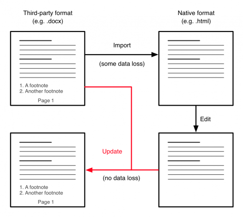
If you’re using one of the few formatting properties in your document that can’t be expressed in CSS, these will be maintained in the document, due to the bidirectional transformation technique used to save documents.

Supported formatting properties

The following properties are supported for both direct formatting and styles:

Paragraph properties

  • Borders (thickness, color, and line type), configurable for each side
  • Background color
  • Text alignment (left, center, right, and justify)
  • Left and right margins (indentation)
  • Separate indentation for the first line (both positive and negative, or “hanging” indents)
  • Top and bottom margins (spacing between paragraphs)
  • Line height (spacing between lines in a paragraph)

Text properties

  • Bold
  • Italic
  • Underline
  • Strikethrough
  • Font name
  • Font size
  • Text color
  • Background (highlight) color

Tables

Table structure (rows, columns, and merged cells) is fully supported. There’s no user interface support for adjusting column widths or merging and splitting cells yet (again, this will come later), but the table structure you see in UX Write will be the same as in Word.

One very powerful feature of .docx is the variety of table formatting options it supports – you can set properties not just for all the cells in the table, but for the first and last rows, first and last columns, even and odd rows, even and odd columns, as well as the cells in each corner of the table. Word itself contains an extensive range of pre-defined table styles with various nice appearances.

These aspects of table styles are not yet supported in UX Write, but I’ve figured out a way of representing all the various options in CSS, so it’s going to be possible to achieve this. In the future, I will be adding the ability to edit table styles within the style manager, enabling you to set all of these properties. Since they can be expressed in CSS, these options will also be available when working with regular HTML documents as well. For now however, tables are formatted using only plain, black borders.

Lists

This was a very challenging one. Word has a completely different concept of what a list actually is, compared to that used by most other formats, including HTML, ODF, and LaTeX. The translation between the two models is far from straightforward, and while I’ve been able to cater for the typical use cases, there are a few uncommon cases that can’t be expressed in HTML.

In HTML, ODF, and LaTeX, a list is an object containing a sequence of items, and each item is an object containing a sequence of paragraphs, tables, or other lists. Thus there is an explicit notion of the items being contained within a list.

Word, strictly speaking, doesn’t actually support lists. What it does support are numbered paragraphs, which are simply normal paragraphs which have an optional numbering definition associated with them. A numbering definition specifies a counter, which increments each time it is used, and a format for the number at each level of indentation (such as arabic or roman numerals, or uppercase/lowercase letters).

With a simple list that has only one paragraph per item, each paragraph is adjacent to the next, and all have the same numbering definition. This can easily be translated into a HTML list, by simply creating an item element (<li>) for each paragraph, and placing those inside a single list element (<ol> or <ul>).

With a list that contains multiple paragraphs inside an item, things start to get a bit more complicated. All paragraphs after the first in a given item have no numbering definition associated with them, so it’s impossible to tell which list item they’re associated with simply by looking at the paragraph itself. What the translation algorithm has to do is go through all the paragraphs in the document and keep track of what the most recent numbering definition it saw was. This determines which list item subsequent paragraphs are placed under.

The algorithm has to be careful when doing this however, as it needs to distinguish between a paragraph that is part of a list item, and a paragraph that comes after the list. The only way to do this is to look at the indentation level of the paragraph:

  • If the paragraph starts at the same horizontal position as the first paragraph in the list item, then it’s part of the same item.
  • If its horizontal position is to the left of the current list item, this means that it comes after the list in question.

So the translation algorithm must look at the indentation level of each paragraph to determine whether it is part of the previous list, or comes after the list. And in the case of nested items, it also has to determine which of those items it is part of.

Another complication is that because there’s no containment relationship between different items in a given list (remember, there is no explicit concept of a “list” in Word), it’s actually possible to have interleaved lists, like this:

1. First item in list A
2. Second item in list A
i. First item in list B
ii. Second item in list B
3. Third item in list A
iii. Third item in list B

It’s impossible to express this in HTML. What will happen in this situation is that the first two items in list B will be placed in a nested list inside list A, and the third item from list B will be put into a separate list that comes after A. Unfortunately this will result in the numbering starting again from i. I don’t think this is likely to be very common though, and I can’t think of a situation in which you would actually want to do something like this (though if you can think of one – let me know).

The main types of numbering formats that CSS supports (decimal, decimal-leading-zero, lower-roman, upper-roman, lower-alpha, upper-alpha) and bullet points (disc, circle, and square) are all supported, and are translated correctly in both directions between their equivalents in Word. Numbering formats involving multiple levels (e.g. 1.1, 1.2, 1.3) in the case of nested lists are not supported, though I may be able to find a way to address this in a later update.

The argument that lists should be represented in a hierarchy as opposed to a flat sequence of paragraphs may seem pedantic and obscure, but it suddenly becomes very important when you try to do outlining. Spend two minutes using OmniOutliner and you’ll very clearly see the opportunities brought about by representing things hierarchically, like the ability to expand and collapse individual items, move entire nested lists around, and so forth. I have plans to expand the outline feature in UX Write to incorporate lists, in addition to the current support for headings.

Automatic numbering

Numbered headings in Word use the same mechanism of numbering definitions as lists, except that the numbering definition to be used is specified in the heading style, rather than as a direct formatting property on the paragraph itself. The default template in Word has numbering off by default, but you can turn it on in Word by going to the style editor, then Heading 1, then Format -> Numbering, then Outline numbered, and select one of the seven different types of outlining formats. In UX Write I’ve simplified this down to a “Numbered headings: on/off” in the settings menu. I’ll add the ability to customise this later.

The style translation algorithm detects styles named “Heading1” through “Heading6” and translates them into CSS style declarations using HTML’s <h1> to <h6> elements. For each of these styles, it looks to see if there is a numbering definition set, and if so, sets the appropriate CSS properties to assign numbers to headings automatically.

Tables and figures are handled differently. Rather than using numbering definitions, Word instead uses field codes placed in the adjacent caption (if present), which increment a named counter, such as “TABLE” or “FIGURE” (though sadly this purely internal name can differ depending on the language in which the document is written – even though it’s never made visible to the user). Because the names of counters aren’t guaranteed to be the same in all documents, the translation algorithm examines what type of object is above each caption, and uses that to decide whether to number it as a table or figure. As with headings, CSS counters are used for making these visible in the document.

Cross-references

Word supports multiple types of cross-references, e.g. just referencing the section number or title, or in the case of a table or figure, including the label and number (e.g. “Table 1”), or even the entire caption (e.g. “Table 1: 2012 Revenue”). UX Write uses hyperlinks (<a> elements in HTML) to represent cross-references, and custom javascript code to generate the text of the cross-reference. I have defined custom class names for each different type of cross-reference, and  the javascript code inspects the class name of an <a> element when updating cross-references to decide what should be displayed as the reference text.

Word represents the targets of cross-references using bookmarks, in contrast to HTML, which uses id attributes on the target element. A bookmark specifies a range of text in a document, and has a name associated with it which is used in any cross-references that point to it. The difference between these and id attributes is that they can appear anywhere in the text, and even span multiple paragraphs.

In determining the id attribute to set on headings, tables, and figures, the translation algorithm searches for the closest bookmark within the object and uses its name as the id attribute. Going in the other direction, if a new heading, table, or figure has been added, it generates a new bookmark in the appropriate position.

Note that in UX Write, cross-references are updated in real-time as you modify the titles of headings, or the captions of figures and tables. They are also updated whenever the associated number changes, such as if you insert a new section above an existing one that’s a target of a reference. Thus, you don’t have to go through the manual process of doing a select all and then pressing F9 (on windows) or Cmd+Option+Shift+U (on the mac) every time you want to ensure all the cross-references and the table of contents are up to date, as you have to do in Word.

Images

Images are partially supported at the moment. Existing images in documents will display in UX Write, and you can add new images from your photo library or current directory in the same manner as you do already. I’ve still yet to implement the ability to replace an existing image with a different one, and to properly translate the size of the image.

Word has two completely different ways of representing images in a document. I actually didn’t realise this until someone sent me a document to test with that had originally been created with an older version of Word and then converted from .doc to .docx. Modern versions of word use the DrawingML language to represent images, while older versions used a separate language called VML. From what I understand, the reason for keeping VML support in .docx was to make it easier to translate from .doc files to .docx, but I’m of the view they should have gotten rid of it completely and had Word automatically translate from VML to DrawingML itself, leaving only one way of representing images. Still, for documents converted from old versions of Word, I’ll have to add support for images represented using VML as well.

One really major befit of .docx over HTML is that you can embed images directly in the document, instead of storing them as separate files. If you’ve been creating HTML documents in UX Write that contain lots of images, you’ve likely noticed your folder in the file browser fill up with lots of image files which you’d rather not see intermixed with your documents. When using .docx, this will become a thing of the past, and you’ll just see the document itself.

Hyperlinks

HTML uses a really simple model for hyperlinks – it just has an element of the form <a href=”http://www.uxproductivity.com”>UX Productivity</a>, and that’s it.

In Word, you have a hyperlink element, which references an “external resource” using a numeric identifier. The text of the hyperlink is stored in the main document, but to find out the target it’s necessary to look at a separate XML file within the word package (which is represented as a zip file containing all images and other associated files). This particular file is known as a relationships file, and contains, among other things, a mapping from the relationship identifier specified in the main part of the document to the actual target URL of the link.

The translation process resolves the external reference in this manner and generates the nice, simple HTML representation given above. Going the other way, it takes the URL, and sees if there are any existing entries in the relationships file with this same URL. If there is, it reuses this same identifier. Otherwise, it generates a new identifier, adds a relationship for that URL, and then uses that new identifier when creating the hyperlink element in the main document content.

Change tracking

This is partially supported, but only to the extent that tracked changes are preserved and displayed in the HTML file, but cannot yet be accepted or rejected. Additionally, changes you make to the document in UX Write itself are not yet recorded (this will come post-1.1.0).

Word represents tracked changes as specially marked text which is either an insertion, deletion, or a formatting change. The first two of these can be directly represented in HTML using the <ins> and <del> elements, which UX Write applies a default style to so that the content of <ins> elements are displayed in blue, and the contents of <del> elements are displayed in red strikethrough. Right now, you can see both of these in the converted document, and even edit them. It’s likely this will be how it stays for the 1.1.0 release, but the next step here is to add the ability to accept/reject changes, see who made them, record changes that are made to the text in UX Write, and show or hide the deleted changes and insertion highlights.

Word’s model of change tracking is really a poor man’s version control, and there are immensely better ways to do it. I’ll be supporting this model for compatibility purposes, but I’m firmly of the view that version control systems like Subversion and Git are really the way to go. Software developers have used these systems for a very long time; in my case, I have a subversion repository containing all the code for UX Write, and as of this evening it contains a total of 4,164 different versions of the code – each one representing a change that I have made, such as adding or tweaking a new feature, or fixing a bug. I also have comments that I’ve written attached to each version, describing what has been changed and why.

I can go back and retrieve any of those 4,164 different versions, or compare any two of them to see exactly what changes have been made. If I had other people working on the project with me, I would also be able to use this to coordinate with them so we have an “authoritative” version of the code, and have multiple people working on the same piece of code with the ability to merge in their changes. This goes far beyond what Word offers and I plan to explore options to integrate this level of flexibility into future versions of UX Write – though this is an issue I’ll get to much later.

Pagination and page layout

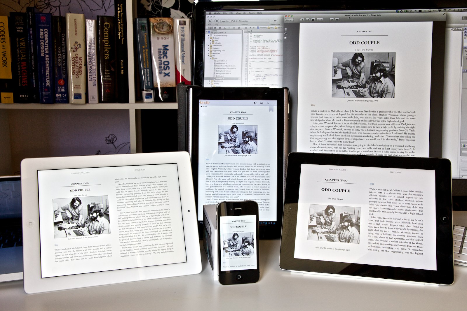
One final point I should mention, and that is very important to understand about UX Write, is that it uses a continuous model of layout with reflowable text. This model is inherited from the underlying web technologies it is based on – every document you edit in UX Write is literally a web page, and is displayed in exactly the same way as it would be in a web browser. In fact, UX Write uses the same layout engine, WebKit, that is used by both Safari and Chrome.

You can’t do page breaks on the web. Every web page is one long piece of content, and you move between different parts of it by scrolling up and down. Additionally, the width of each paragraph depends on the width of your browser window (at least, on well-designed sites); this feature is especially important for phones and tablets which have smaller screen sizes than regular computers. Reading an A4 PDF document on an iPhone or iPad mini involves a lot of squinting and/or scrolling, and really isn’t a pleasant experience. Because of its basis on web technologies, and the fact that UX Write is designed for the small screens present on the iPhone and iPad, it always adjusts the page layout in a suitable manner to make it easy to read, and even lets you choose a scaling factor to make the text larger or smaller, depending on your preferences and vision quality.

If you’re coming from Word, you might find this quite jarring. UX Write is really only WYSIWYG in the sense of what you see is what you get in a web browser, but not what you get in print. During editing there’s no way to see where page breaks will be placed in your document, and you can’t rely on paragraphs being a specific width, because someone reading your document might be using an iPad mini, or even simply rotate their full-size iPad from landscape to portrait, which changes the width of the page.

This approach reflects the philosophy of HTML and LaTeX that content is of primary importance, and layout secondary. Your ideas, your words, and the way you organise them is what you pour so many hours of effort into – what it looks like when you finally publish it is important, but a separate concern that can be dealt with in the final stages before publication. I’m aware that not everyone may agree with this approach, and that’s fine – I’m not trying to cater for every possible usage scenario. In the case of UX Write, I’ve decided to focus on this way of doing things based on the authoring approach I learnt while working in academia, and I consider this approach the right one for many other types of writing as well.

Having said this, I have some ideas about how I might be able to address page layout capabilities in the future, at minimum including the ability to specify explicit page breaks. There are a number of complexities in achieving this, but I’ll be looking into this at some point in the future.

Summary

Wow! You got through all that? Congratulations, and thanks a lot for your interest! As you can see, there are a ton of complex issues here that I’ve addressed over the last few months, which is why it’s taking so long, and why I’m being so careful about making sure this all works reliably before doing a public release.

It’s tempting, from an end-user point of view, to think of word documents as rather simple things that can just be edited easily and passed around – which they are, if you’re only using Word. But since Microsoft haven’t released Word for the iPad yet (and I’m not convinced they ever will, despite persistent rumours), using this wonderful device to do the writing you normally do on your PC or Mac requires someone else to come in and fill the gap. That’s me.

Rather than trying to produce an exact clone of word, I’ve tried to address all these challenges in a way that fits in closely with modern, industry-standard web technologies and caters well for the mobile form factor, as well as providing a powerful environment that makes it as easy as possible to work with the structure of your document. On this last point, I have a bunch of ideas about how to leverage the structured editing approach to provide a range of different ways of navigating and working with the high-level organisation of your documents. But those will have to wait for another post.

As always, comments are welcome.

Update on Microsoft Word Support, Part 1

It’s been a long time since I posted about this so I wanted to give a brief update on where things are at regarding file format support and the upcoming 1.1.0 release of UX Write. I posted back in October that I had decided to support both .docx (Microsoft Word) and .odt (OpenOffice) formats, in addition to the current native HTML format.

As it turns out, the amount of work involved in getting .docx support operational has been much greater than I expected. I’ve been focusing primarily on that over the last couple of months (as it’s the most popular of the two), and have decided that I will release 1.1.0 with .docx support only, and add ODF at a later point in time. While I could delay the release further until I have both file formats working, I don’t think there’s any benefit in doing so. There’s a lot of people waiting on .docx support, so I want to make this available both for the benefit of existing users and because it’s important for the commercial success of the app.

What Does Microsoft Word Support Mean?

It’s tempting to pose the question “Is this app compatible with Microsoft Word?”. It would be nice to give a straight “yes” or “no” answer, but unfortunately the situation is more complicated than that. Microsoft Word has literally hundreds of features, and no other app has or will ever support all of them. All other word processors which work with one or more of Word’s file formats support only a subset of these features. This is typically ok however, as most people only use a small, common set of features rather than every single one.

I’m focusing on supporting only the most important and widely-used features, from the viewpoint of professional, academic, and technical writing — for the most part matching the set of document structure features common in LaTeX (e.g. sections, figures, tables, references), as well as almost all the formatting properties that can be expressed in HTML and CSS. Since all the other word processors for the iPad address the former either very poorly or not at all, UX Write 1.1.0 will likely have the most feature-rich support for .docx on the platform upon its release.

Note that there is a big difference between .docx and .doc files – in fact they are two entirely separate file formats. UX Write will only support .docx, which is a modern, well-documented, XML-based file format that is (relatively) easy to read and write. The older .doc format is a much more complicated binary file format that would be a great deal more difficult to support. I’m aware that some people still use it, and while I could support it with perhaps another six months of work, I feel that time is better spent on improving other aspects of the app. You can easily convert from .doc to .docx (and back again) using any recent version of Word.

Maintaining Document Integrity

The normal way for a word processor to support third-party file formats is to provide import and export facilities. Import converts the document from the third-party format to the program’s native format, and export converts back the other way.

The problem is that this is a lossy process – it is rare for the native format to support a superset of the third-party format’s features, and converting between the two inevitably means you’re going to lose some structural or formatting information along the way. If you look around the support forums for Pages and similar apps you will find many instances of people complaining they’ve lost formatting or other information like footnotes when going back and forth between their iPad and Mac or PC.

UX Write instead uses a technique called bidirectional transformation to interface with third-party file formats such as .docx. Although its native format is HTML, which doesn’t support all the features of Word (such as embedded spreadsheets), and you won’t be able to see or edit these unsupported features, they won’t be lost when you save your document. This is because instead of the saving process completely replacing the original document with a new one converted from HTML, it takes the original document, works out what has changed in the HTML version, and makes the corresponding changes to the original document. This has the following implication:

Any formatting or other features of .docx that UX Write doesn’t support will be kept in-tact on save. You will be able to safely move back and forth between UX Write on your iPad and Microsoft Word on your PC or Mac without losing data.

To understand why this is, let’s have a look at how the traditional import/export process works:

Import - Export

Figure 1: Import/export

Figure 1 illustrates an example of a document containing headings, text, footnotes, and page numbers. When the document is imported, the headings and text (which HTML supports) are maintained, but the footnotes and page numbers (which HTML doesn’t support) are lost. The user makes some changes to the document and then saves it. During save, the export process deletes the original document and replaces it with a new version re-created entirely from the HTML version. Because the latter did not contain the footnotes or page numbers, these are also absent from the saved version.

Bidirectional Transformation

Figure 2: Bidirectional transformation

Figure 2 illustrates the bidirectional transformation process used in UX Write. When the document is first opened, it is converted from .docx to HTML. This is the same process as before, and maintains the headings and text, while losing the footnotes and page numbers (HTML has no notion of separate pages in a document). After the user has edited the file, they save it.

Now here’s where the difference comes in: Instead of completely re-creating the document, bidirectional transformation takes both the original .docx document and the modified HTML document as input, and updates the original based on the changes that have been made to the HTML version. Any changes, additions, or deletions to the headings or text will be applied, but the footnotes and page numbers will be left completely untouched. The user syncs their document with their Mac or PC and opens it in Microsoft Word, and is happy to see that everything is still in place.

Incremental Feature Support

Now that you understand how bidirectional transformation works (trust me, this is a very much simplified explanation of events!), you can see how it is possible for UX Write to support only some features of Microsoft Word, without losing all the other information in your document. In particular, it permits features to be incrementally supported. For example, the first release in the 1.1.x series won’t support footnotes, but this is something I’ll be working on for future versions. In the meantime, while you won’t be able to view or edit footnotes, they’ll at least still be there when take your document back to Microsoft Word on your PC or Mac.

I’ll be putting up another post soon which details the features that are currently supported in the development version and will be available when 1.1.0 is released, as well as others that will be added in the future.