Tabs and multiple spaces

I often get questions about why UX Write doesn’t allow you to insert tabs into a document, or place multiple spaces after a period. Some people have also asked about why existing tabs in a Word document show up as a grey [tab] marker. In this post I’m going to explain why this is.

UX Write uses HTML – the language of the web – for displaying and editing documents. When you open and save a Word document, UX Write converts it to HTML and back again. The HTML content is displayed on screen using a software component called WebKit, which is the same layout engine as used by Safari (and formerly Chrome). Every document you edit in UX Write is quite literally a web page; the only difference with a web browser is that your document is stored locally on your device, not published online.

HTML provides a slightly different set of layout features to Word. While most features can be converted back and forth without problems, there are some features present only in HTML, and some present only in Word. Thus, UX Write can never provide a 100% faithful rendering of all Word documents, and doing so has never been a design goal.

I chose HTML partly because it’s so widely used – as the foundation of the web – and partly because it enabled me to use an existing layout engine, rather than spend years writing my own. HTML is also much better designed than Word, and with a minimal amount of training a person can reasonably read and write HTML code directly. This is not the case with Word documents.

Tabs

HTML doesn’t support tabs. There’re simply not used not the web.

While I’m not sure of the exact rationale for the W3C (who designed HTML) to exclude tab support, I suspect the reason is because it’s unnecessary, in the sense that everything you can achieve with tabs you can also achieve without.

There are two main use cases I’m aware of:

1. Paragraph indentation. This can be achieved in both HTML and Word by changing either the left margin or text indent formatting properties of the paragraph or style.

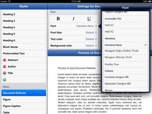
In UX Write, go into the formatting menu and then either direct formatting or the style manager, and set these as appropriate. I recommend creating a style for the indented paragraph, so that you can do this again easily by selecting the style from the formatting menu, and later adjust the amount of indentation if you so wish.

2. Tabular data. This can be achieved in both HTML and Word by using tables, either with or without a border. Instead of adjusting tab stops, you adjust column widths. Instead of setting the alignment of a tab stop, you set the alignment of a table cell or column.

Even better, with tables it’s possible to create a custom style that defines the horizontal alignment, vertical alignment, and border appearance once and then use this for all tables in your document, so you don’t have to go formatting each manually.

Unfortunately UX Write doesn’t support customising table formatting at present, but this is coming in the near future. However, any customisations you make in Word will be retained by UX Write. I’m also considering providing the ability to convert tabs to a combination of indented paragraphs and tables when the app encounters a document containing these, so you don’t have to do so manually.

Multiple spaces after a period

By default, HTML collapses all whitespace in the source file, which means that any consecutive sequence of one or more spaces or newline characters in the HTML code is displayed on-screen in the same way as if there were a single space. If you view the source of a HTML document, you’ll typically see that a single paragraph is actually spread over multiple lines, e.g.:

<p>Here is a HTML paragraph. Its
content spans multiple lines in
the source file, for convenience of
editing in a text editor, but the
author's intention is to have it
displayed using word-wrapping according
to the user's browser window size.</p>

In a sense, HTML considers a sequence of space and newline characters simply as an instruction: “Don’t put the surrounding characters next to each other”. In fact, if you use justified text, the amount of space between different words will vary, as the layout engine will space the words out appropriately to ensure that both the left and right edges of all lines except the last line up with the left and right margins. In HTML, and most other file formats, spaces are not a fixed width character, and two spaces are considered no different than one.

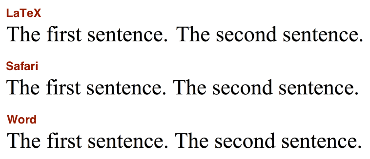
While I’m aware of the controversy surrounding the “one space or two after a period” debate, I think it’s a pointless one. This problem was already solved more than 30 years ago by Donald Knuth when he created TeX, which automatically adds a small amount of additional whitespace between sentences, and gives higher priority to inter-sentence spacing than to inter-word spacing when it needs to stretch out a line when performing justification. If you really care about typography this much, you’ll already be using a system like TeX or LaTeX to prepare your final publication-ready output. The image below shows the same two sentences as typeset by LaTeX, Safari, and Microsoft Word; in all three cases, the text was entered with only a single space after the period.

Sentence spacing

The good news is that built-in LaTeX typesetting is coming to UX Write in the very near future. Most of my development effort over the past couple of months has been in porting LaTeX to the iPad, and when this work is complete you’ll be able to take advantage of the beautiful typographic output it produces when printing or generating PDF files, producing much more professional-looking results than is possible with Word. Stay tuned for more on this.

Why does typing two spaces insert a period?

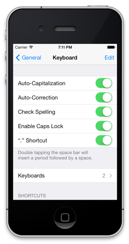
The iOS text entry system has a built-in feature, which I believe is on by default, that allows you to type two spaces in succession to get a period, as a shortcut mechanism. This is an option which can be configured under the in the Settings app, under General > Keyboard > “.” Shortcut:

Period shortcut

While you can turn this off on a system-wide basis, the setting only applies to apps which use Apple’s built-in text entry mechanism (which most do). However, for apps like UX Write that provide their own text input handling, changing the setting has no effect. Unfortunately, to the best of my knowledge Apple do not provide any mechanism by which apps can determine whether this setting is on or off, so it’s not possible to automatically adjust the input behaviour based on this.

UX Write re-implements this feature itself, to match the behaviour seen in other apps when the setting is on. Before I implemented this, I received a number of complaints about the fact that it didn’t add the period after pressing two spaces, which is why I added support for it. Since then, I’ve received only a handful of complaints about the fact that it does add a period, so of the two options I’ve concluded that it’s better to have it on. This also seems to make sense given what I’ve discussed above about the inability (and pointlessness) of typing multiple spaces manually in a document.

Understanding Layout in UX Write

I sometimes get questions from people asking why some particular layout-related aspect of UX Write doesn’t work the same way as in Microsoft Word or Pages. The answers all invariably come down differences in the approaches these programs take to layout — that is, the way in which they display the text you’ve entered on screen, and the level of control given to you over how this layout is done. Because UX Write is based on Safari’s layout engine, its capabilities depend entirely on what is possible to do on a web page, which excludes certain features like tabs, page breaks, footnotes [1], and columns [2].

Microsoft Word, OpenOffice Writer, and Pages are all based around the idea of WYSIWYG (What You See Is What You Get). This is a visual approach to writing, where the position of text and other elements in the document is remains unchanged regardless of how you are viewing the document, whether on-screen or in print. This model is appropriate for people who need precise control over exactly how their final published document will look, and want to have that layout control combined with text editing facilities in the same program. If you have these needs, then UX Write is not a good choice for you as it specifically does not attempt to provide a fixed layout, for reasons I’ve written about previously.

UX Write, HTML, Markdown, LaTeX, and LyX are based around the idea of WYSIWYM (What You See Is What You Mean). This is a structural approach to writing, where you add text, sections, subsections etc. in an abstract manner, and the way in which they are actually displayed depends on the circumstances in which the document is being viewed. Often referred to as the separation of content and presentation, this model is appropriate for people who care only about the content of their writing, and are happy for the presentation to be tailored to suit the output device (tablet, phone, desktop, print), subject to some level of customisation (such as fonts and colours) defined in a stylesheet. If you have these needs, UX Write is really your only choice on the iPad right now — I’ve still yet to see another app which properly supports even styles, not to mention automatic numbering, table of contents generation, and other features that depend on structural information.

You use this latter model every day when you browse the web. Well-designed websites [3] will wrap their content to the width of your browser window or your phone/tablet screen, and this will change as you resize your window or rotate your device between portrait and landscape. On some desktop browsers, you can also change the font size to what is most comfortable for you to read. E-book software like iBooks and Kindle also follows this model. If you’ve ever tried to read a PDF document formatted for a full-size A4 page on your iPhone or iPad mini, you’ll undoubtedly have been frustrated by the small text and excessive scrolling; reflowable text avoids this.

Neither the visual or structural approaches are inherently “right” or “wrong” — everyone has different needs, and you should pick the app that’s right for you. UX Write is very much built around the structural approach, because it’s intended for long-form technical and academic writing, though is useful in many other contexts as well.

I realise now that the current messaging on the app’s website is too ambiguous — it compares UX Write to Pages, which I now think is a pointless comparison given that they’re designed for different types of users. I’ve actually found it quite a challenging task to communicate what UX Write is to an audience unfamiliar with the structural writing approach, and the app often gets judged badly when measured on those grounds. As part of a larger rebranding exercise I’m working on with a colleague of mine, I plan to redo the website to try and clarify the app’s focus on technical and academic writing, and make the differences from visually-oriented word processors clearer.

[1] Though they can be “faked”, like this

[2] Columns have actually been added recently to the web standards, but without pagination, placing an entire document in columns would cause the second column to start half-way through the document. The reader would need to scroll down the entire first column, then right back up to the top, before they can read the second column. That’s not good.

[3] And I don’t consider this blog particularly well-designed, though the latest WordPress update does seem to finally implement text wrapping when you resize the window, and it’s readable on an iPhone without zooming.

Page Layout in the Era of Electronic Publishing

The basic design of modern word processors has its roots in the WYSIWYG (“what you see is what you get”) revolution of the 1980s, which became possible with the introduction of the graphical user interface. Whereas people once had to use a text editor to enter markup by hand, and never really knew what their document was going to look like to readers until they printed it, WYSIWYG provided an accurate on-screen depiction of how the final print output would appear.

For most of the history of personal computing, documents have been written for print. Even when they were viewed on a desktop or laptop, the screen was always large enough to display either the whole page — or at least the full width of the page, with the possibility to scroll vertically. However in the last few years we’ve witnessed an incredible shift in the way people consume content — e-readers and tablets are now widely used by people for reading books, papers, and notes.

Because devices like the iPad, Kindle, and Android tablets have screens that are smaller than a typical printed page — particularly in the case of 7″ tablets — it’s necessary for software that displays documents to take a different approach to layout than what has traditionally been used. Whereas in a Microsoft Word document or a PDF file you have a fixed page layout where the placement of text on a page is predictable, e-book readers instead use a reflowable layout in which the text is adjusted to suit the screen size, orientation, and user preferences. If you’re writing an e-book, you can’t rely on the assumption that page breaks will occur in particular places, since this will be different for every reader. In other words, what you see is not what you get.

e-book layout

If you look closely at the picture above (click to see full-size), you’ll notice that the page being displayed is different on every device. My Macbook Pro, with a 24″ external monitor, has lots of screen real estate available and can thus fit a lot more text on the page than any of the other devices. The two iPads are both displaying the same page, but because the one on the right has a non-retina display, I’m using a larger font than on the retina iPad on the left, for legibility — meaning less text fits on the screen. The Android tablet (sorry Steve) has different dimensions and is in portrait mode, while the iPhone’s screen is so small that it only has room for the picture plus two lines of text.

On every device, the book has a different number of pages. And neither has the same number of pages as the print version.

Reflowable Content and Editing

The new reality of multi-format publishing we find ourselves in demands a different approach to document editing than was the norm during the print-only era of the 1980s and much of the 1990s. This has actually been a long time coming — the web ushered in the first major platform for viewing reflowable content, with most early web pages readily adapting to whatever size your browser window was. However graphic designers schooled in the print mindset soon came along and changed that, forcing every website into a fixed-width layout.

This worked fine for quite a while, as pretty much everyone’s computer screens were large enough to display these pages, but mobile browsing sucked for a very long time until Apple finally came along with the iPhone and Mobile Safari, with its zoom feature. For many websites however, this didn’t fully solve the problem, as although you could zoom in and out, you often had to repeatedly scroll left and right as you read through a paragraph, because some web designer had decided that their layout looked best at 1024×768, and forced the text to be that wide. The web design community realised this problem fairly quickly and started adapting their sites to either serve up a different layout to mobile devices, or use a reflowable layout that results in a good-looking document regardless of the screen size.

So if you’re designing a word processor in the early 2010s which has to run on the iPad, iPhone, and now the iPad mini, do you use fixed layout, or reflowable layout?

Based on what I’ve discussed above, the answer might seem pretty obvious, but it’s actually a bit more nuanced than that. Many people are used to the fixed layout of Microsoft Word and similar programs, and there’s a lot of established practice about the way in which formatting is done — such as entering in a series of blank lines to cause text to appear at the start of the next page, tabs to indent text to a specific width, placement of images relative to the top or bottom of the page, etc. These things don’t translate well into reflowable layout where the width of a page, and the location of page breaks (if they exist at all, which they don’t on the web) can differ between devices, and even on the same device if the user rotates it or changes their preferred text size.

There’s an inherent conflict between the goals of achieving full compatibility with the way in which desktop word processors are often used, and what works well on a tablet. Some apps have opted to simply copy the pure WYSIWYG model — dividing documents into fixed-size pages, always using a fixed width and providing a zoom feature so you can enlarge the text. While this makes it possible (in principle at least) to maintain the exact same formatting as you would see in Word, it causes lots of usability problems on small screens, particularly with the iPad mini and iPhone.

Trade-offs

There’s no ideal solution to this dilemma — it’s necessary to either provide a fixed layout, and try to preserve the exact placement of everything as it will appear in print on the small screen, or to use a reflowable layout, where the text and images are adapted to be readable on the small screen. Both approaches involve trade-offs, and which one is best depends very much on what the user’s primary goal is — layout or writing.

In designing UX Write, I decided to go with the reflowable option, because I think that of the two, it provides the best user experience on a small screen. This is also based on the assumption that the primary interest of people who use the app is their content, rather than how it looks. Of course this assumption doesn’t hold for everybody — depending on your needs, you may need finer control over layout and want to see an exact print-like representation of your document during editing. However UX Write does provide a print preview option (it’s called “Generate PDF” — they’re one and the same), so it is still possible to get this view, just not in real time.

As with many design decisions that have to be made with an app like this, things like layout approaches and file format support involve trade-offs. Different developers will make different choices on these issues based on the sort use cases they’re targeting with their app, and at the end of the day from a user’s perspective it’s necessary to choose the right tool for the job. In the case of UX Write, my goal has been to cater for multi-format publishing, where the separation between content and presentation is a necessary aspect, and to provide the best possible user experience for writing on mobile devices.

Creating Templates in UX Write

One of the features I’ve had a lot of requests for recently is the ability to create “template” documents, whereby you set up all of your styles in the way you want them, and then all new documents you create will have the same look and feel.

Version 1.0.5 has just hit the app store, and adds the ability to do this, via some additional file management features – specifically the ability to duplicate and rename files. Here’s how:

1. Create a new document, giving it a name like “Template” (you can choose any name)

2. Open the document and configure the styles (go to the formatting menu then “Edit Styles”).

As an example, let’s make the default font Helvetica Neue, change all Heading 1 elements to blue with a bottom border, and all Heading 2 elements to italic blue. We’ll also add custom styles for Title, Author, and Abstract:

Creating a new template – Setting up Styles

3. Now you have your template. Leave the content empty, and go back to the file browser.

4. To create a new document based on this template, press and hold on the template document, and select “Duplicate” from the menu.

5. The document will initially by called “Template copy”, but you can immediately start typing in a new name, e.g. “Project Plan”.

Now you can write your document, format it using the styles you set up earlier, and it will look just as you intended from the template:

Example document created from a template