When I began developing UX Write, I never consciously thought about having to do anything “special” to get it running on mobile. Initially on Android, but after a short period moved to iOS, it began much like the development of any other mobile app — I just used the tools available to implement the functionality I needed. Specifically, these tools were:
- A system-provided version of WebKit
- Native support for parsing and rendering HTML
- A JavaScript runtime environment with access to the DOM
- System-provided APIs (UIKit) for building a native user interface
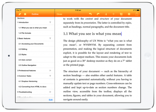
The result was something that felt like a native iPad app because it was a native iPad app. All of the toolbars, menus, and so forth utilised the built-in user interface components provided by the platform, and I tried to follow Apple’s iOS human interface guidelines as closely as possible. It just seemed like the natural thing to do.
Only after UX Write was on the app store did I start learning about other attempts to achieve the same end result but based on ports of existing desktop suites, such as Microsoft Office and OpenOffice. Most of these efforts fall into one of the following two categories:
- Remote access clients to a server-hosted version of a desktop office suite, basically using the iPad as a remote desktop or VNC client. Examples include CloudOn and Documents Unlimited.
- Native ports of a suite to mobile. These are much rarer; there’s an Android port of OpenOffice, and reportedly an in-progress port of LibreOffice as well. On Windows 8 tablets, such as the Surface, Microsoft made available a version of Office that was effectively identical to the desktop version, right down to the same menus, dialog boxes, and other UI elements.
Both approaches are fundamentally flawed.
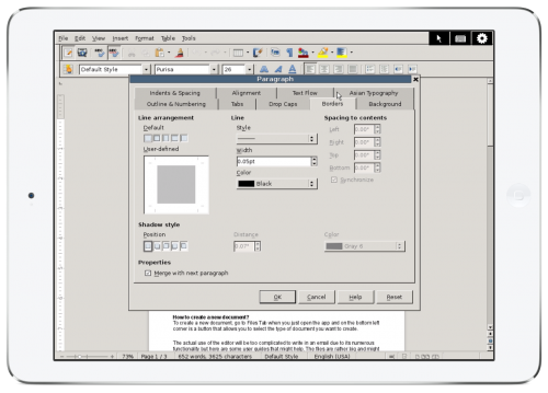
The first requires a fast, reliable Internet connection, which even those of us who live in major metropolitan areas don’t have 24/7 (think traveling or going out). The second, as well as the first, squeezes far too much onto a tablet screen to provide something usable. Desktops and laptops have larger screens and more precise pointing devices (mice & trackpads), but the combination of a small screen and fat fingers does not lend itself to tiny little checkboxes, buttons, and scroll bars.

Remote access to OpenOffice from an iPad, complete with scroll bars, windows, and a mouse pointer (Documents Unlimited)
On mobile — especially on phones, but also tablets — you don’t have the luxury of being able to fill up the screen with innumerable buttons and other widgets. You must be judicious in your use of screen real-estate, and design an interface hierarchy that avoids unnecessary duplication and moves all but the most important options into sub-menus or alternate screens.
There’s a long tradition of mobile-first productivity apps that began well before the emergence of the iPad and Android tablets. Platforms like the PalmPilot, Windows CE, Symbian, and Blackberry all had various apps available for them which provided a subset of the functionality of their desktop counterparts. Notable among these were Documents to Go and QuickOffice, which both made it across from these more limited platforms to iOS and Android, though still retaining their fairly minimal feature set. Since the iPad appeared, a large collection of writing apps have followed in their footsteps — that is, being targeted at mobile, not desktops. UX Write is among this latter group, though closer to the desktop-level feature set than most others.
When Microsoft finally released Office for the iPad, they did something I didn’t think they were capable of: They actually started from scratch with a new UI implementation, completely abandoning the desktop interface present on Windows and the Mac. I specifically use the term implementation here, as the design is closely based on the ribbon used in the desktop versions Office, to provide a familiar experience. But by starting with a new implementation instead of trying to do what would have been terrible port, and by reusing the core rendering and file format support that make up the Mac version of Office, they ended up with a product that is actually pretty decent to use on mobile, though sadly some rather important capabilities like custom styles and tables of contents did not make it across.
As I look towards the future of UX Write, which most likely involves an expansion onto not just other mobile platforms but also desktop and web, I’ve gained an appreciation for the benefits that starting from scratch — and building an app in a flexible and portable way — can provide. The architecture of UX Write is such that there are several components that can be taken more or less verbatim and, with a few compatibility adjustments, made to work on other platforms. Each port needs it’s own distinct user interface design appropriate for the platform — the Mac version of UX Write I spent some time prototyping a while back provides a native OS X user interface, which is not the same as the iOS version. But the core code is able to remain the same.
As much as I’d like to claim I planned all this deliberately, I can’t — it’s simply a natural outcome of developing for mobile first, and keeping open the possibility of an Android port in addition to the current iOS version. After seeing the results of other efforts to take large, legacy codebases designed for desktop systems and bring them to mobile, I think I took the right approach.
I believe that the best way to future-proof an application is to build it in terms of a small number of core, portable libraries with minimal dependencies; then, for each platform, build a native application layer that ties them all together and follows the user interface conventions of the host platform. This leaves open the possibility of porting to other platforms (including other classes of platforms — desktop, mobile, and web) with less difficulty than with monolithic architectures. It also allows for the provision of a high-quality user experience that matches what users expect from a native app.

