Moving Files and Folders

(or “Why File Synchronisation is Hard”)

One of the questions I get asked most often is why it’s not currently possible to move files or folders in UX Write. While this might seem like a very simple feature to add, there’s actually a lot more to the story, due to the need to ensure reliable file synchronisation in which no data loss can ever occur.

Normally, this is all handled by the operating system and third-party sync clients like that provided by Dropbox. However, Apple made the tremendously unfortunate decision to exclude any notion of a user-visible filesystem on iOS, so this isn’t possible. Desktop operating systems have had built-in file management capabilities for more than thirty years, and everyone who’s ever used a personal computer is familiar with the concept of organising their files into different folders.

While unnecessary for casual usage like browsing the web or playing games, file management is absolutely critical for content creation and management; its omission from iOS cripples the iPad as a productivity device. Nonetheless, it is possible for individual app developers to work around this limitation, but doing so is highly non-trivial in the case where synchronisation with an online file storage service is needed.

For the developer, moving files locally on a device is trivial to implement. There’s programming interfaces built in to the operating system to do this, and it’s a simple task to create a user interface for selecting the files to move and their destination. The difficulty lies in synchronising those changes with a server (or “The Cloud”, if you prefer that term) in such a way that guarantees no data gets lost in the process.

Clients and server

With online storage services, it’s possible to have multiple devices and people with access to a particular account. Software like the Dropbox desktop client, and UX Write itself, allow changes to be made to files while you are offline, and then later push those changes to the server. However, cases can sometimes arise in which different people have changed or moved the same file or folder while offline, and then later reconnect to the Internet and sync with the server. This is where things can go disastrously wrong, if conflicts are not handled carefully by the software.

An Example

Suppose Bob and Alice have access to a shared account, and are working with the same set of documents relating to a particular project. Both are working offline, when Bob decides to move a folder to a different location and Alice simultaneously makes some changes to a document inside that folder.

When they subsequently reconnect to the Internet, their iPad or PC will try to sync with the sever. Whoever happens to sync first will “win” and have their changes applied to the server successfully, while the “loser” will run into errors, with the server reporting that the folder doesn’t exist any more.

If Bob wins, the folder will be moved, but when Alice’s device tries to upload her modified version, it will encounter an error because the folder it was in no longer exists at its previous location. An incorrectly-implemented syncing mechanism may conclude that because it can no longer see a folder at that location on the server, it must have been deleted and that it should therefore result in the local copy being deleted as well — which happens to contain Alice’s modified document. The syncing mechanism would then see what appears to be a completely new folder on the server, and download that. But Alice’s changes would be gone.

Solutions

File synchronisation is a complex topic, but necessarily has to be addressed to at least some extent by any app that lets you work offline with documents whose primary copy resides online. It’s unacceptable for an app to blindly push changes to a server without checking to see if the files or folders in question have been modified by someone else, and it’s also unacceptable for the app to download all changes from the server and overwrite local copies that may have been modified independently. It’s necessary to provide both conflict detection and resolution capabilities, with the latter preferably involving automatic merging of changes where possible.

There are many possible solutions to these problems, which have been implemented in various syncing clients and version control systems. Git provides what I consider to be the most elegant solution to this (plus a whole host of other things), but that’s another topic entirely which I won’t get into right now.

The simplest approach I’ve been considering for an initial implementation of moving is to do it synchronously — that is, require you to be online at the time of the move, and wait until the server has reported a successful completion of the operation before allowing you to continue using the program. In computer science terms, this is known as an “atomic test and set” operation, where a check is performed to see if the change is valid, and if so, the change is made, all in one indivisible operation, avoiding race conditions. The alternative is to perform the move asynchronously — that is, in the background at a later point in time; but that has all the problems mentioned above, and requires keeping track of lots of extra information in order to do it reliably.

In the long term, I plan to integrate support for Git directly into UX Write, so you’ll have access to its full set of functionality, including versioning, branching & merging, and conflict resolution. Software developers use this all the time for collaboration, and I’d encourage you to learn more about it if you’re interested. I’ll be posting more about this integration in the future once I’ve had a chance to think it through further.

Doesn’t iCloud handle all of this?

Sort of, but only in the context of a single application and a single user. Since UX Write only runs on the iPhone and iPad, many people use it in conjunction with other applications like Microsoft Word on their desktop, so it’s necessary to sync the files between different platforms. iCloud has a restriction that only allows files to be accessed from within the application that created them, and provides neither a generic filesystem model of the sort found on Mac, Windows, or Linux, nor does it cater for the need to edit a given document with different applications. So that basically rules it out, as far as I’m concerned.

In Summary

Better file management facilities are coming to UX Write, but as described above these aren’t straightforward to provide in the context of the ecosystem we have today where everything is stored and synced online across multiple devices. At the moment, my primary focus is on building a word processor, not a file manager, so the latter has secondary priority. But I am very much aware of the need for improvements in this area, and will get to them eventually.

Content, Structure, and Presentation

UX Write is designed around three primary aspects of electronic documents: content, structure, and presentation. To appreciate how and why the app works the way it does, it’s important to understand each of these aspects and how they relate to each other:

  • Content is simply the words and images in your document — nothing more, nothing less. It is the most important aspect, because it contains the primary value — your idea, your story, your message; whatever information you intend to convey to the reader.
  • Structure is the way in which your document is organised. Typically this involves a hierarchy of sections with one or more levels of headings, as well as the arrangement of content into paragraphs, lists, tables, and figures. Any special designation attached to certain paragraphs, such as the document title or a footnote, is also considered structure.
  • Presentation is what your document looks like. It is determined by formatting and layout options such as fonts, colours, margins, and line spacing. These options are either set on a case-by-case basis via direct formatting, or, preferably, using styles to specify how headings, normal paragraphs, and other structural elements should appear.

All three of these are critical aspects of any professional documentation tool; when tied together, they permit the automation of many editing and publishing tasks. Structural information, in particular, is necessary for generating a table of contents, numbering headings, figures, and tables, supplying the text of cross-references, and providing navigational aids during editing such as an outline view. Furthermore, the use of styles enables the presentation to be based on the structure, so a consistent visual design can be reliably maintained throughout the whole document without manual effort.

Word processors vary greatly in their support for the structural aspects of editing. Some provide none at all — requiring all presentation to be specified via direct formatting, which makes it difficult to achieve a consistent look and feel or conform to organisational style guides. Others provide very basic facilities, such as lists and tables, but little else. The most capable provide full support for all aspects of structure, such as headings, built-in and custom styles, automatic numbering, and table of contents generation.

Even when a word processor supports advanced features, they are not always obvious from the user interface, and are only revealed in their full glory after you’ve climbed a steep learning curve. The canonical example is Microsoft Word, which has hundreds of features hidden away in various menus and dialog boxes, but has a default toolbar configuration which encourages bad practices like direct formatting, as I discussed in a previous post.

UX Write is designed first and foremost for structured writing, with the hierarchical organisation of sections made explicit, and direct formatting deliberately discouraged in favour of styles. This is why it feels so different to use than Word — it’s a cleaner, more disciplined approach to document authoring, which is optimised for writing, with presentation as a secondary concern. The focus is on helping you with your most important task — getting your message across.

iOS 7 Update and New Features

iOS 7 has finally been released today, and with it the first set of apps updated for the new version of the platform. Among them is a major new release of UX Write, which addresses language support, and adds several important new editing features. UX Write 1.2 requires iOS 7, and will run on the iPad 2 or later, iPad mini, and iPhone 4 or later.

Here’s what’s new:

User Interface Localisation

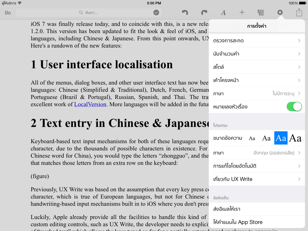
All menus, dialog boxes, and other user interface text have now been translated into the following languages: Chinese (Simplified/Traditional), Dutch, French, German, Italian, Japanese, Korean, Portuguese (Brazil/Portugal), Russian, Spanish, and Thai. The translations are thanks to the excellent work of LocalVersion. More languages will be added in the future.

UX Write in Thai

Text Entry in Chinese & Japanese

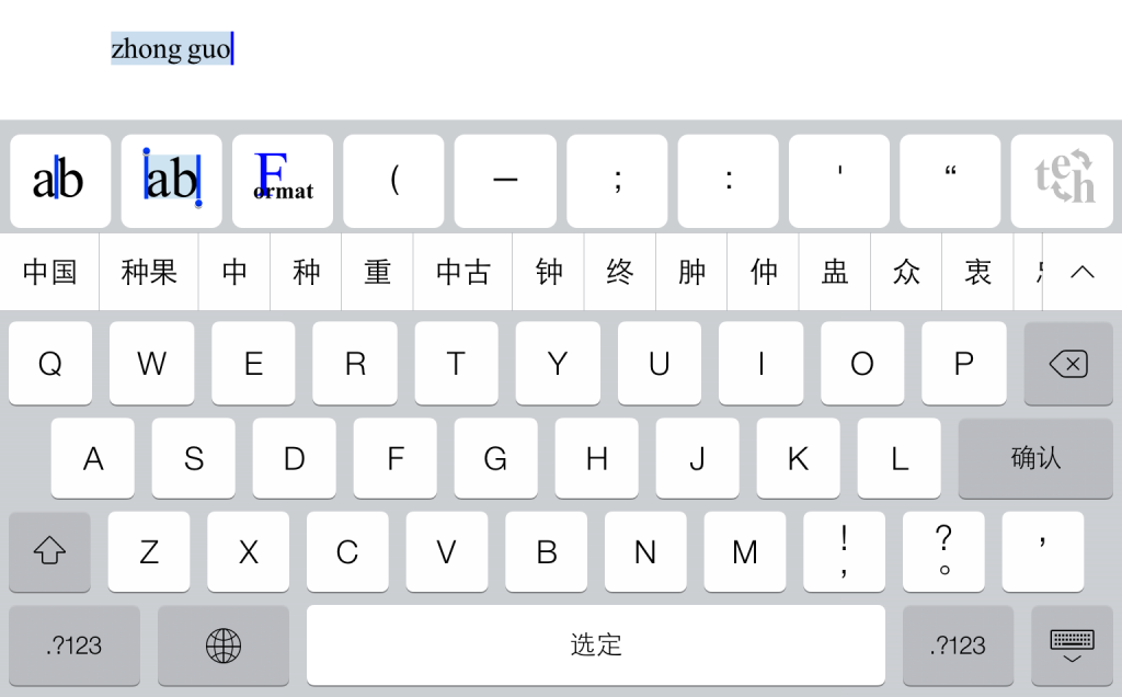
Keyboard-based text input mechanisms for east-asian languages require multiple key presses per character, due to the existence of many thousands of possible characters. For example, to type 中国 (the Chinese word for China), you would type the letters “zhongguo”, and then select from a list of candidate words from an extra row on the keyboard.

Chinese text input

Previously, UX Write operated under the assumption that every key press corresponded to an individual character, which is true of European languages, but not of Chinese or Japanese. There are also handwriting-based input mechanisms for these languages built in to iOS where you don’t press keys at all.

Luckily, Apple already provide all of the keyboard logic for taking this kind of input from the user, including the word choice mechanism described above. However, apps like UX Write which use custom text editing components have to explicitly cooperate with this logic by supporting so-called “marked text”, which is the sequence of letters that has been typed by the user, but is “provisional” in the sense that it will later become a different sequence of characters when you finally choose a word. It was this relatively small piece logic that UX Write was missing, and now that I’ve added support for this, the key-based and handwriting-based input mechanisms for Chinese and Japanese now work.

Find & Replace

You wanted it, you’ve got it. This has been the most requested feature of all over the past few months, and is finally in. You know that empty space at the top of the toolbar where other apps put direct formatting properties like font size and paragraph alignment that really belong in styles? I’ve used that space instead for a search bar — just like you have in Safari. Just tap on it and type in your search term. On the iPhone, it is accessible under the Settings menu.

Find and replace

If you tap the little arrow icon next to this bar, you’ll get some additional options. You can use these for find & replace (as opposed to just find), specifying whether to perform a case-sensitive or case-insensitive search, and also searching based on regular expressions. [see note at end of this post about a replace bug for which a fix will be available in a few days]

Regular expressions, if you haven’t encountered them before, are a way of specifying patterns of text that you want to match, rather than an exact match of a particular word or phrase. UX Write supports regular expressions in both the search text and the replacement text. If you’re an old-school Unix hacker you’ll be familiar with the concept; otherwise, you can learn about them here. UX Write’s regular expression support uses the NSRegularExpression class that is part of iOS; you can see the details in all their glory on Apple’s developer site.

One suggestion a beta tester made to me was offering a “whole words only” option for find & replace. I’ll be providing this in a future update.

Spell Check

Another often-requested feature, this is now available as well. You can access it from the Settings menu, and it will highlight any words it finds that aren’t in the dictionary. The user interface for correcting a word is the same as what you use for autocorrect — you can select from a list of alternatives, or add it to the custom dictionary (which can also be edited through the Settings menu).

One caveat with spell checking in UX Write is that it only works with languages for which Apple provides a built-in dictionary. These languages are: Danish, Dutch, English, French, German, Italian, Portuguese, Russian, Spanish, and Swedish. If Apple later start including dictionaries for other languages, then these will be automatically supported for spell checking and autocorrect purposes by UX Write.

Word Count

There’s not really much to say about this I guess other than yep, it’s there.

I did find out however rather late in the piece that Japanese is written without spaces between words, and I’ve been told that in Chinese spaces are often omitted as well. Thai is the same; I’m actually studying Thai at the moment and while the books we’re using in class use spaces between words to help us comprehend sentences more easily, this is not done for mainstream Thai writing.

So for now at least, word count only works properly for languages in which words are separated by spaces. However, it does also show the total number of characters and paragraphs in the document as well, so if either of those is what you’re after, you can get them as well. I’ll be adding an extra item for character count excluding spaces in a future update.

iOS 7

The release of iOS 7 is one of the most significant in the platform’s history, after the introduction of third-party apps in 2008, and multitasking in 2010. While on the outside there’s a complete visual refresh, there’s also a lot of new features “under the hood” that I’ll be taking advantage of in future versions of UX Write.

One of those in particular is real-time pagination in WebKit, which will allow me to provide an option in UX Write that will show you where page breaks will occur in the printed document. A lot of people coming from an MS Word background have been asking for this, but I haven’t been able to provide it to date due to limitations in WebKit. Unfortunately, the pagination support in the initial release of iOS 7 doesn’t work correctly, so I have to wait for Apple to fix the bugs I’ve reported before I can make use of it in UX Write.

Other new features I plan to utilise include improved background file transfer, AirDrop support, and CSS regions (enabling magazine-style page layout). I’ve really only scratched the surface of what iOS 7 has to offer at this stage, because all the beta versions of 1.2 had to be compatible with iOS 6 as very few of my beta testers have developer accounts.

Now that iOS 7 is available to the public however, new releases of UX Write from now onwards will depend on it. While I’ve been reluctant to drop support for older versions — particularly because iOS 7 won’t run on the original iPad — I’ve concluded that the effort required to support both is too much to be worth it, and I’m better off putting my time into adding new features. If you have an iPad 2 or later (including iPad mini), or an iPhone 4 or later, you can update to iOS 7 for free.

Known Issues

There’s been a lot of “behind the scenes” changes in the UX Write codebase for this version which won’t be readily apparent to you as a user, but have increased the risk of bugs in this version. It’s had a fair amount of testing while in beta, however there are several issues that have come up since I submitted 1.2.0 to the app store a week ago:

  • When opening an existing Word document that doesn’t already contain heading styles, these will not show up in the formatting menu. If you encounter this problem, open up the document in Word, mark one or more paragraphs using the heading styles you want, and then take the document back to UX Write.
  • The external keyboard is not recognised in some cases. If this happens, just tap on the screen and this should get it to recognise the keyboard.
  • The replace field doesn’t work on the iPad. Currently there’s no workaround for this; it only works on the iPhone. Yes, this is a bit embarrassing.

I’ve already fixed all three of these bugs (plus a few others) and submitted a 1.2.1 update to Apple. It should be approved for release in the next few days. Do let me know if you find any other problems.

Update (19 September): Apple approved the 1.2.1 update in just over 24 hours. Normally it takes 4-5 days; I’m impressed!