UX Write version 1.0.1

At long last, the first update to the initial release has hit the App Store. Here’s what’s changed:

New Features

  • Auto Correct support for the following languages (based on the built-in iOS dictionaries): Danish, Dutch, Australian/Canadian/UK/US English, French, German, Italian, Portuguese, Russian, Spanish, Swedish
  • Full external keyboard support, including all keyboard shortcuts
  • Proper handling of text entry in Korean
  • Auto Save (currently occurs every 3 minutes)
  • Dictation (on supported devices)
  • Ability to enable or disable numbering for specific headings

Bug fixes

  • Inability to edit built-in table style
  • Applying direct formatting within a table cell messing up column widths
  • Several crashes during typing and selection

Other improvements

  • Optional “toggle” mode for virtual trackpad
  • Scroll document when using virtual trackpad

The other piece of exciting news I have is that I’ve decided to run a special pricing offer on the app for the next two weeks. From now until August the 27th, you can get the app for US$6, instead of the regular price of US$15 (note that prices vary somewhat between different countries depending on exchange rates).

Most of the feedback I’ve had regarding pricing to date has basically been of the form “It’s not worth $15 for what it currently does, but will be once all the promised features are in”. So this is basically a strategy to get the app out to more people and increase awareness. Feedback is also really important to me at this early stage (perhaps even more so than sales), so the more people who use it, the more data points I can get on what features people want to see both in the short term and long term.

I’ve been giving a lot of thought to pricing strategy over the past few weeks. Sales started off really well after the initial release and publicity, but have been fairly slow over the last couple of weeks. Pricing is one of the most difficult things to get right on the app store, and I’ve decided I need to experiment and get feedback on this issue. One option I’m considering is having a “basic” and “pro” version of the app (the latter available as an in-app purchase), which will give users an opportunity to try out the basic features without having to put up too much money, and then upgrade to get the more advanced features if and when they need them. Exactly what features will be included in each version is yet to be decided. Note that if I do go down this route, everyone who has bought the app so far (either at the $15 price or at the current 60% discount) will automatically get access to the pro version as these features become available.

If you have any thoughts on this approach I’d be really interested to hear them.

Since submitting this version about a week and a half ago, I’ve been continuing to work on improvements in a number of areas, almost all of which have been minor usability issues that, while not critical, do result in a usage experience that isn’t as smooth as it should be. Version 1.0.2 is getting pretty close to ready, and I anticipate submitting it to the app store fairly soon. I’ll have more to say on these improvements in future posts, as well as some of the more common questions I’ve received about the app of late.

If you’ve yet to try out UX Write, check it out here.

Thoughts on the First Week Since Release

It’s been about a week now since the first version of UX Write was approved for release on the App Store. This has been one of the most intense weeks of my career — it’s the first time I’ve released a commercial product, and had more than a small number of beta testers using the app. Many people have contacted me with questions and comments, so I thought I’d address some of these here.

When developing an app like this, it’s difficult to decide exactly when it has crossed the line from “not ready” to “ready”. I could have waited a few more months and had MS Word support and other features in for 1.0, but I believe it’s better to release a piece of software as soon as it has the minimum level of functionality needed for people to start using it. I’ve already had lots of useful feedback, which will result in a much better app a few months from now than if I’d continued development in a vacuum.

Here are the most common issues that have been raised:

Auto Correct only works for US English

I’ve received a lot more interest than I’d expected from users in non-English speaking countries, particularly within Europe. Understandably, their #1 complaint has been the lack of auto correct support for their native language. Evidently I miscalculated the demand for this feature, and probably should have spent the extra couple of days required to implement it before releasing. It’s basically just a matter of UI support for selecting the language, since all the language dictionaries and word suggestion logic are provided by iOS itself. This is my top priority for the first update.

I already have users in 25 different countries, so localisation is going to be a priority for me going forward. Now that I have a revenue stream, I can afford to hire a professional localisation company to translate the software and test the editing facilities in various languages. I have a meeting set up with one such company this week, and plan to start this process as soon as possible.

It doesn’t work properly with external keyboards

This is another problem I was already planning to fix, but didn’t appreciate how critical it was for so many people. Personally I always use the on-screen keyboard, because I find it pretty easy to use, and it’s more convenient for carrying the iPad around. It turns out though that quite a lot of people don’t like it, and I can appreciate now why Microsoft included a fold-out keyboard on the cases for the Surface.

Unfortunately, iOS doesn’t provide an API for the external keyboard, which means there’s no direct way for an app to be notified when the user presses a key. The built-in editing controls, which most apps use, work fine — but for custom editing controls like that used by UX Write, there is no support. It would be very easy for Apple to add this functionality, and I really wish they would do so soon.

Having said this, I’ve come up with a workaround that will allow me to support all the standard arrow keys and keyboard shortcuts. It involves some black magic using a hidden text field, a specially-crafted pattern of characters, and some code that observes changes in the cursor position and selection range to infer what key combination has been pressed. It’s ugly, but it will work.

Both this and the auto correct language support will be fixed in version 1.1, due in early August.

No support for Microsoft Word documents

This has been raised by many people, which I completely expected. I’m well aware of the importance of MS Word compatibility, and I think that UX Write is only really going to take off once that compatibility is there. As I mentioned earlier, I figured it was better to get the first release out now, so I can start getting feedback from a wider audience, while I continue to work on Word support and new features. LaTeX is also a high priority — even though it has a much smaller market share than Word, it is widely used in academia, particularly in science and mathematics. Given that my own background is in computer science, this part of the market is very important to me.

By the way, I’m taking the time to do this stuff properly. One of the most common complaints I’ve heard about some of the other iPad word processors is that while they can open and save Word documents, some of the formatting and structural information gets destroyed. I’m implementing Word and LaTeX support in such a way that even though UX Write won’t understand all of the formatting properties and other elements in the document, it will still preserve them when you save the file. So you won’t have to worry about messing up your document just because you made some changes to it on your iPad.

Pricing

While I haven’t had a large number of comments about this, the ones I’ve seen have varied a lot. Some people think it’s great value for money, while others have said it’s too expensive. The pricing was a really difficult decision to make, and I’m still not sure if I’ve got it right.

Although UX Write is more expensive than the other word processors for the iPad, it provides a lot more features, and is really aimed at the high-end professional market rather than the average user. UX Write is a premium product — if you just need to take notes or write short documents without much structure, there are cheaper alternatives on the App Store that will meet your needs. But if you need advanced features like styles, cross-referencing, outline editing, automatic table of contents generation, and seamless file synchronisation, then UX Write is currently the only app out there that will do what you want.

Since I think that UX Write is ideally suited for use in schools and universities, I’ve decided to participate in Apple’s educational volume discount program. If you’re an educational institution registered as part of this program, and are purchasing licenses for UX Write in bulk, you can now get the app for 50% of its retail price (see the link for more details). Unfortunately this program is only available in the US at the moment, but according to Apple they will be bringing it to other countries soon.

Final thoughts

I’ve received a lot of very positive feedback from people who are used to using semi-structured authoring techniques in their desktop word processor, and have been looking for an app like UX Write for a very long time. Initial sales have been quite encouraging, and I’m feeling pretty confident about the product’s future. There’s still quite a lot of work to be done, but I think you’ll find that over the coming months UX Write will emerge as a very strong competitor in the iPad word processing market.

A more cooperative Auto Correct for the iPad

Auto Correct is a handy feature of iOS which immediately fixes your typing mistakes by replacing any incorrectly spelt words with ones that are correctly spelt. Due to the size of the iPad and iPhone keyboards, and the lack of tactile feedback, it’s a lot easier to make typing mistakes than on a physical keyboard. So Auto Correct is quite useful on these devices.

But there’s a problem: Auto Correct doesn’t always get it right. Given an incorrectly spelt word, there are usually several possible candidates for replacement, and no software is intelligent enough to guess which one you meant in all cases. The word you typed may even be valid, but just absent from the system’s dictionary.

What you often end up with is documents or text messages in which the words all have correct spelling, but not necessarily the correct meaning. In some cases this can lead to some very embarrassing results — many of which have been thoughtfully archived for public reference at one of my favourite websites, damnyouautocorrect.com.

In the early testing I did with UX Write, the most annoying aspect by far was iOS’s built-in Auto Correct mechanism. I tried turning it off for a while, but I found that my documents were filled with lots of typing mistakes, so I decided that on balance, it was better to leave it on. But I still wasn’t happy with it. Even though it does give you the opportunity to cancel a replacement, you have to do so immediately, which I found a major interruption to my writing flow.

So I’ve come up with a way to make it better.

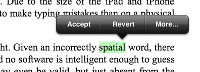
In UX Write, when you make a typing mistake and Auto Correct “fixes” it for you, it highlights the replacement. You can continue typing, and then some time later go back and review your text for all the highlighted replacements and accept or revert each one. Tapping on a highlighted replacement brings up the following menu:

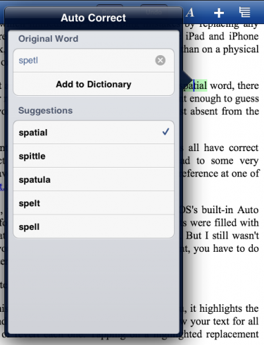
“Accept” indicates the replacement is correct, and that the program should perform the same replacement in the future automatically without highlighting it. “Revert” changes the text back to what you originally typed. “More” brings up another menu with a list of alternative spellings, and an option to add the original word (which you can edit) to your custom dictionary:

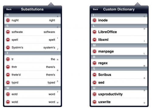
Both the custom dictionary and list of previously-accepted substitutions are accessible from the settings menu. If you accidentally add a word to the dictionary or accept a substitution that you didn’t mean to, you can easily go the appropriate list and remove it.

The only limitation of this in the first release of UX Write is that it only works for US English. I’m planning on adding application-wide and document-specific language settings, so you can have the correction mechanism work in any language that iOS supports.

Text Selection on the iPad, Part 2

Daniel Hooper’s text selection concept video posted a couple of months ago received a tremendous amount of positive feedback from many tech blogs and readers. Like many others, I think it is a revolutionary idea for making text editing on the iPad a much more pleasant experience. Its main advantage, in my opinion, is that you can move around and select text without your hands needing to leave the keyboard. Another advantage is that when selecting text, you avoid the delay associated with the standard long-press gesture.

I’m happy to announce that I now have this mechanism fully implemented in version 1.0 of UX Write. The app just been submitted to Apple for approval and will hopefully be available on the app store fairly soon. I’ve done some things differently to Daniel’s original prototype, partly because of some implementation problems I ran into earlier, and also some usability suggestions I’ve had from others who’ve seen it.

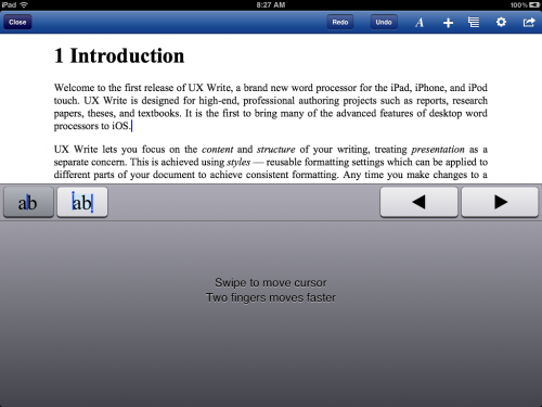
Rather than using a gesture over the normal keyboard to move the cursor, you need to first hold down the “move cursor” key (at the far left of the top keyboard row). This switches to a custom input view representing a virtual trackpad, which you can drag your fingers around. Dragging with one finger moves the cursor slowly, and dragging with two fingers moves the cursor faster, and snaps to the closest word boundary.

Next to the move key is the selection key, which works in a similar manner, but can be used to select text. You can toggle between movement and selection just by moving the finger that you used to press either key — this makes it easy to position the cursor at the start of a word and then subsequently select it. Also shown in the virtual trackpad view are left and right keys, which can be used for both movement and selection.

The reasons for using the virtual trackpad, rather than having the gestures be made just on top of the regular keyboard, are twofold:

  1. I found some cases in which my own gestures would conflict with behaviour that was built in to the system keyboard. One of these is where you can hold down certain keys to bring up a list of variations on the character — like ÿ and ŷ for the y key. Another case was with two-finger gestures, which were sometimes conflicting with the split keyboard gesture in which you drag two fingers in opposite directions to split the keyboard into two parts. Also, some keyboard types, like Chinese, allow you to draw characters by hand, and this wouldn’t have worked at all with the drag-to-move gesture.By using my own custom input view instead of the standard keyboard, I was able to completely avoid these conflicts, as well as conflicts with other system keyboard behaviour that Apple may choose to introduce in the future.
  2. Someone suggested to me that performing drag gestures over the keyboard felt unnatural, since it’s not something you would ever do on a physical keyboard. Everyone is familiar with the concept of a trackpad, so displaying the this instead makes it much more obvious what you’re supposed to do with it. The fact that this is triggered by the move and select keys, which are clearly visible in the top row of the keyboard, also makes it much easier for users who might not otherwise be aware of the feature to discover it.

Although Apple provides public APIs for implementing your own custom keyboard views and accessory views (the extra row of keys above the system keyboard), there is unfortunately no API support at present for replicating the appearance of standard system keys. To achieve a consistent look and feel, developers have to come up with their own custom mechanism for mimicking the appearance of the standard keys for their own additional keys. While this isn’t overly difficult, it would be good to see future versions of iOS expose an API for this purpose, since it’s something that a number of applications do.

I’ve actually come to form the opinion that extending the keyboard like this is actually an excellent way to provide quick access to program features that are useful during typing and editing. I have also added a set of formatting keys for changing basic formatting such as bold, italic, and list type, and have some ideas along similar lines for an equation editor. But these things will have to wait for another post…

Update: I’ve now posted a video of this in action: http://www.youtube.com/watch?v=SbVDk5qrR44

Why Most People Don’t Understand Styles

Styles, a feature of most desktop word processors, help you achieve consistent formatting throughout your document. For each paragraph, you simply indicate whether it is a heading, normal text, or some other type of content, and then you can separately change the formatting for all paragraphs with that style from the one place. Styles also indicate certain structural information about the document — for example, a word processor that knows which text corresponds to a heading can provide automatic numbering, a table of contents, and an outline view.

Despite the advantages of styles, many people don’t know how to use them, and end up wasting lots of time formatting their documents manually. Examples of this include selecting text and changing the font size to make it look like a heading, and directly entering in section numbers. This seems to work fine at first, until you have a 40 page document and decide you want to change all the headings to a different font size, or add another section near the start of your document. I once saw a PhD thesis whose author, who shall remain nameless, had constructed their table of contents manually.

For those of us who know how to use styles, or other structured authoring tools such as LaTeX, it can be tempting to simply blame the user for not spending time learning how to use their word processor. But I think the real fault lies in the user interface design of most word processors, which emphasise direct formatting over styles. As a result, many users do not even know that styles exist. I’m going to talk about Microsoft Word here, since it’s the most popular, but others based on similar designs — such as OpenOffice and Google Docs — deserve an equal share of the blame.

Let’s have a look at the user interface of Word 2011 for the Mac (click to enlarge):

Can you spot the problem here? The majority of the toolbar is devoted to direct formatting, and styles are presented as if they are a secondary option, rather than the default way of doing things. Many of the buttons on the left side of the toolbar are things that in a structured authoring process you would rarely, if ever, use. Styles are given only a small portion of the space, which sends the message that changing formatting details such as font, size, line spacing, and paragraph alignment is best done on a case-by-case basis.

You can’t see it in the screenshot, but there’s a button which lets you select from a more complete list of styles; it’s just invisible until you move your mouse over the area where the button is. If you resize the window to make it narrower, this area is collapsed to a single “Styles” button which, when clicked, brings up the list. This in itself is not a problem — the issue is that the direct formatting options are made a great deal more prominent than the style options, which means most people will naturally gravitate towards the former.

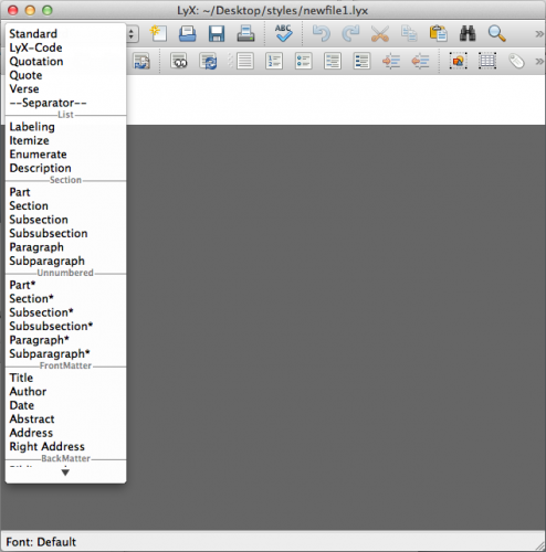
Contrast this with LyX, in which the first item in the toolbar is the current environment (LyX and LaTeX’s term for styles). Normally, this is “Standard” (corresponding to “Normal” in Word), but if you click on the toolbar item you get a list of common environments, as shown below:

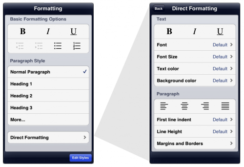
As with much of UX Write, the basic philosophy I’ve taken in designing the user interface is inspired by LyX, but adapted to suit the iPad. UX Write also supports direct formatting, but hides it one level back from the rest of the user interface. The screenshot below shows UX Write’s formatting menu on the left, and the direct formatting menu (which appears in place of the first menu when you select “Direct Formatting”) on the right:

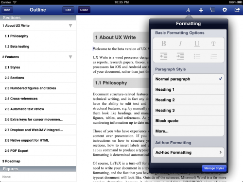
The “Basic Formatting Options” and “Paragraph Style” sections of the formatting menu are intended to suffice for 98% of cases. The “More…” item expands the list with additional built-in styles, and also allows you to add your own custom styles. The “Edit Styles” button at the bottom of the popover brings up a full-screen style management interface, in which you can edit both built-in and custom styles. For the 2% of cases where you do actually have a need to set the formatting uniquely for one specific piece of text, you can do so using the direct formatting menu.

I’m hopeful that this will result in users finding it much easier to not only discover the concept of styles, but also make use of them. I think Word and its clones have their priorities the wrong way round in terms of formatting, and teach users bad habits which ultimately make it more difficult to work with large documents. The main downside to my approach is that it may initially be a turn-off for people who have become used to applying direct formatting everywhere — but hopefully this interface is clear enough to make it obvious that styles are the way to go.

I’m interested in feedback on this design – what do you think about it?

Text Selection on the iPad

I came across a post on Hacker News yesterday discussing a brilliant new idea for performing cursor movement and text selection on the iPad keyboard, developed by Daniel Hooper. You can see a demo of Daniel’s prototype below:

He’s certainly right that text editing could be made a lot more efficient. Accurate cursor positioning, in particular, is quite difficult with the default iOS mechanism. I already have cursor movement keys in my app like those in IA Writer, but this approach looks even better.

I had a go at implementing this mechanism in UX Write, with partial success:

  • Single-finger cursor movement is fine. You can swipe on the keyboard in any direction to move the cursor, and it moves at one-third of the speed you move your finger, for very precise positioning. Cursor movement only begins once you’ve moved your finger a certain distance away from the original key, so you won’t see it occurring accidentally while you’re simply typing.
  • Two-finger movement is problematic because it conflicts with the built-in iOS split keyboard gesture. I have it working most of the time, but in certain cases the touch events will be interpreted as an attempt by the user to split the keyboard. As in the video, using two fingers allows you to move the cursor faster.
  • Selecting text by holding down shift while you drag with another finger also works most of the time, but in some cases results in extra characters being inserted. With shift pressed, dragging from one key to another causes iOS to highlight the other key and display a list of alternative characters; this doesn’t happen when shift is not pressed. It’s these keys that are causing problems for me at the moment.

My implementation works by intercepting touch events in UIApplication’s sendEvent method, and detecting those which are within the keyboard window. It’s possible to filter out events before passing them on to the application, which might be a solution to the problem.

While I’ve still got some more work to do on two-finger movement and selection, I’m really happy with the cursor movement and think it’s going to make editing a much nicer experience. Daniel has suggested that users petition Apple to include this functionality in iOS itself, but why wait for that? As app developers, we can start implementing this right now. The jailbreak community has in fact just done this, and plans to have it available tomorrow.

I’m going to come back to this in a few days once I’ve finished up table editing and made some more tweaks to the style editor which I want to have in for the next beta, but will post an update with more details once I’ve gotten this all working properly.

File synchronisation

One of the least exciting but nonetheless necessary tasks involved with writing a content creation app for iOS is implementing a way to get data in and out of the app. While adding iTunes file sharing support is trivially easy, it’s pretty much expected that your app will also support online file storage services like Dropbox and WebDAV, which involves a lot more work. Most productivity apps on the iPad support this, so I had a look at number of them to see how they do it.

I found three main approaches:

  • Store all the documents locally, and provide import and export options for transferring individual documents between the iPad and the server. I don’t like this approach, because it means that if you’re regularly going back and forth between your computer and your iPad, you have to manually do the import/export each time, which is a pain.
  • Use iCloud. This is fine if you only ever want to access documents from the same app you created them in, the app is available for both your iPad/iPhone and your Mac, and the app supports iCloud on both platforms. But there’s no generic way of getting at your files from a PC or Mac, which I think makes it pretty useless. iWork documents are an exception, but even then you can only access them through a web interface, which doesn’t provide automatic synchronisation.
  • Allow access to files directly from the server, downloading them as necessary, and uploading them when they are saved.

I decided to go with this third approach, since it allows you to keep all your documents in one place and access them from anywhere – without the hassle of manually copying them back and forth all the time. But I noticed a couple of problems with the way in which the apps I looked at achieved this:

  • After closing a document, no local copy is kept on the iPad. It has to be re-downloaded each time you open it, even if it hasn’t changed on the server. Worse, you can’t access it offline – if you want to make some edits to your document on the train to work, you’re out of luck.
  • When saving a file, you are forced to wait for the upload to complete before you can carry on with your work.

In UX Write, I’ve implemented a file syncing mechanism similar to that of the PC and Mac Dropbox client. It works as follows:

  • UX Write keeps a local copy of any file you’ve previously opened. At regular intervals, or when you press “refresh”, it checks to see if these files have changed on the server and downloads any updated versions – in the background. You can also tell it to maintain a complete local copy of specific folders from your account.
  • If you try to open a file and there’s already a local copy of the latest version, it will open immediately.
  • When you save a file, it is written to local storage immediately, and uploaded in the background, while you continue with your work. If you’re not connected to the Internet at the time, it will upload the file later on, as soon as it gets a chance.
  • If the file has been modified independently on both the server and your iPad, you’ll be notified and given a chance to save your copy under a different name so you can later reconcile the differences.

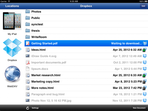
The screenshot above shows what the file management interface looks like. Files that have a copy stored locally are shown in black, and files that exist on the server but not on the iPad are shown in grey. The icon to the right of each file shows its synchronisation status; the green ‘+’ over the iPad in some of these icons indicates that the file has been modified locally and is scheduled to be uploaded as soon as any other transfers have completed.

I’ve implemented these features in a generic manner which is not specific to any particular storage service, so it’s fairly easy for me to add support for new services. The first release of UX Write will support Dropbox and WebDAV, with other services being included in the future.

Announcing UX Write

So I’ve decided to start writing publicly about the project I’ve been working on for the past few months: a brand new word processor for the iPad. At first glance this may seem a bit redundant — there are already many of these in existence, so why does the world need another? Well, UX Write differs from other tablet word processors in some fundamental and important ways. In particular, it is designed specifically for professional writers who work with structured documents, in which content and presentation are separate concerns.

What this means for you as an author is that while writing your document, you can focus solely on what your writing says, while later on, either you or someone else decides what it looks like. During the writing process, you enter text, organize it into sections, add figures and tables, and label any paragraphs that have special meaning, such as “Exercise” or “Example”. Separately, you choose an existing template or define your own styles which specify formatting attributes such as fonts, colours, paragraph alignment, margins, indentation, and line spacing. You can thus achieve consistent formatting throughout your whole document without having to manually format paragraphs on a case-by-case basis.

Of course, desktop word processors such as Microsoft Word and OpenOffice have worked like this for many years, but for some reason, developers of similar apps for tablets have chosen to omit these features. I looked at all of the word processors available for both iOS and Android tablets and couldn’t find a single one which works as I’ve described above. As an academic, I was looking for something I could use for writing things like research papers, lecture notes, and books. Ideally, I wanted something like LyX (a graphical frontend to LaTeX), which I’ve used for many years, including for writing my entire PhD thesis.

I love the tablet form factor, and think that hardware-wise, they are excellent tools for getting work done on the go. But the software is currently lacking — we need more professional-quality content creation tools that provide the same level of functionality as their desktop counterparts. One particularly good example is the iPad version of OmniGraffle — which, as far as I can tell, includes every single feature that is present in the desktop version.

UX Write is designed to meet the needs of professional writers such as academics, graduate students, technical writers, any anyone else writing large documents such as manuals and reports. The app is not yet complete, and I’ve just recently got the first version out to a small number of beta testers. But I need more — if you write in a professional capacity, and want to be a part of bringing structured authoring tools to the iPad, I’d love to have you try out the program and give me your feedback!

Drop me a line at peter@uxproductivity.com.