Tabs and multiple spaces

I often get questions about why UX Write doesn’t allow you to insert tabs into a document, or place multiple spaces after a period. Some people have also asked about why existing tabs in a Word document show up as a grey [tab] marker. In this post I’m going to explain why this is.

UX Write uses HTML – the language of the web – for displaying and editing documents. When you open and save a Word document, UX Write converts it to HTML and back again. The HTML content is displayed on screen using a software component called WebKit, which is the same layout engine as used by Safari (and formerly Chrome). Every document you edit in UX Write is quite literally a web page; the only difference with a web browser is that your document is stored locally on your device, not published online.

HTML provides a slightly different set of layout features to Word. While most features can be converted back and forth without problems, there are some features present only in HTML, and some present only in Word. Thus, UX Write can never provide a 100% faithful rendering of all Word documents, and doing so has never been a design goal.

I chose HTML partly because it’s so widely used – as the foundation of the web – and partly because it enabled me to use an existing layout engine, rather than spend years writing my own. HTML is also much better designed than Word, and with a minimal amount of training a person can reasonably read and write HTML code directly. This is not the case with Word documents.

Tabs

HTML doesn’t support tabs. There’re simply not used not the web.

While I’m not sure of the exact rationale for the W3C (who designed HTML) to exclude tab support, I suspect the reason is because it’s unnecessary, in the sense that everything you can achieve with tabs you can also achieve without.

There are two main use cases I’m aware of:

1. Paragraph indentation. This can be achieved in both HTML and Word by changing either the left margin or text indent formatting properties of the paragraph or style.

In UX Write, go into the formatting menu and then either direct formatting or the style manager, and set these as appropriate. I recommend creating a style for the indented paragraph, so that you can do this again easily by selecting the style from the formatting menu, and later adjust the amount of indentation if you so wish.

2. Tabular data. This can be achieved in both HTML and Word by using tables, either with or without a border. Instead of adjusting tab stops, you adjust column widths. Instead of setting the alignment of a tab stop, you set the alignment of a table cell or column.

Even better, with tables it’s possible to create a custom style that defines the horizontal alignment, vertical alignment, and border appearance once and then use this for all tables in your document, so you don’t have to go formatting each manually.

Unfortunately UX Write doesn’t support customising table formatting at present, but this is coming in the near future. However, any customisations you make in Word will be retained by UX Write. I’m also considering providing the ability to convert tabs to a combination of indented paragraphs and tables when the app encounters a document containing these, so you don’t have to do so manually.

Multiple spaces after a period

By default, HTML collapses all whitespace in the source file, which means that any consecutive sequence of one or more spaces or newline characters in the HTML code is displayed on-screen in the same way as if there were a single space. If you view the source of a HTML document, you’ll typically see that a single paragraph is actually spread over multiple lines, e.g.:

<p>Here is a HTML paragraph. Its
content spans multiple lines in
the source file, for convenience of
editing in a text editor, but the
author's intention is to have it
displayed using word-wrapping according
to the user's browser window size.</p>

In a sense, HTML considers a sequence of space and newline characters simply as an instruction: “Don’t put the surrounding characters next to each other”. In fact, if you use justified text, the amount of space between different words will vary, as the layout engine will space the words out appropriately to ensure that both the left and right edges of all lines except the last line up with the left and right margins. In HTML, and most other file formats, spaces are not a fixed width character, and two spaces are considered no different than one.

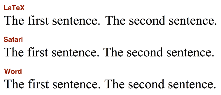
While I’m aware of the controversy surrounding the “one space or two after a period” debate, I think it’s a pointless one. This problem was already solved more than 30 years ago by Donald Knuth when he created TeX, which automatically adds a small amount of additional whitespace between sentences, and gives higher priority to inter-sentence spacing than to inter-word spacing when it needs to stretch out a line when performing justification. If you really care about typography this much, you’ll already be using a system like TeX or LaTeX to prepare your final publication-ready output. The image below shows the same two sentences as typeset by LaTeX, Safari, and Microsoft Word; in all three cases, the text was entered with only a single space after the period.
Sentence spacing

The good news is that built-in LaTeX typesetting is coming to UX Write in the very near future. Most of my development effort over the past couple of months has been in porting LaTeX to the iPad, and when this work is complete you’ll be able to take advantage of the beautiful typographic output it produces when printing or generating PDF files, producing much more professional-looking results than is possible with Word. Stay tuned for more on this.

Why does typing two spaces insert a period?

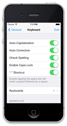
The iOS text entry system has a built-in feature, which I believe is on by default, that allows you to type two spaces in succession to get a period, as a shortcut mechanism. This is an option which can be configured under the in the Settings app, under General > Keyboard > “.” Shortcut:
Period shortcut

While you can turn this off on a system-wide basis, the setting only applies to apps which use Apple’s built-in text entry mechanism (which most do). However, for apps like UX Write that provide their own text input handling, changing the setting has no effect. Unfortunately, to the best of my knowledge Apple do not provide any mechanism by which apps can determine whether this setting is on or off, so it’s not possible to automatically adjust the input behaviour based on this.

UX Write re-implements this feature itself, to match the behaviour seen in other apps when the setting is on. Before I implemented this, I received a number of complaints about the fact that it didn’t add the period after pressing two spaces, which is why I added support for it. Since then, I’ve received only a handful of complaints about the fact that it does add a period, so of the two options I’ve concluded that it’s better to have it on. This also seems to make sense given what I’ve discussed above about the inability (and pointlessness) of typing multiple spaces manually in a document.

Footnotes, Headers, and Footers

Among the features I’ve had the most requests for are the ability to add footnotes to documents, as well as custom page headers and footers. These are standard features of print-oriented word processors and many people naturally expect to find them in UX Write. So I thought I’d give an outline of my plans for supporting these. There’s some rather tricky issues involved due to the web-oriented nature of the app, but fortunately these are solvable.

WebKit for editing

UX Write actually doesn’t do any layout itself; it is entirely dependent on the WebKit rendering engine, as used in Safari and Chrome, for displaying all content. WebKit is based on HTML and CSS, the document structure and formatting languages of the web, which work somewhat differently to the file formats used by print-oriented word processors such as Microsoft Word and OpenOffice Writer. The differences — in particular, HTML’s continuous, non-paginated nature — have important implications for the feature set that is possible to support in UX Write.

Writing a (sufficiently capable) custom layout engine is a task that takes a sizeable team of people and many years of effort, which simply wasn’t a viable option for this app. Relying on WebKit makes it possible to invest all development resources entirely on editing capabilities, rather than all of the logic to calculate where each piece of text goes and how it’s formatted. This is why UX Write possesses so many more features than its competitors — all the hard work of layout is already taken care of. WebKit is also built in to iOS, which makes it a very convenient choice for use in an iPhone/iPad word processor.

By using WebKit, UX Write inherits both the capabilities and limitations of HTML. Although HTML has a lot of great features — styles, tables, images, lists, hyperlinks, and a ton of formatting options — it’s not particularly good at paginated, print-based output. On the web, there’s no notion of a document being divided into a series of (virtual or real) sheets of paper like in a traditional pure-WYSIWYG word processor. I’ve previously discussed why relying on explicit pagination during editing doesn’t make sense in the context of writing for e-books or the web, but it is relevant for documents that are ultimately destined for print output only. Unfortunately, among the features HTML lacks are — you guessed it — footnotes, headers, and footers.

Currently, UX Write uses WebKit for both editing and print/PDF output — but there’s some changes on the way for the latter.

LaTeX for printing

WebKit isn’t the only layout engine out there of course. Another popular one is Donald Knuth’s famous TeX typesetting engine, which was designed in the early 1980s for high-quality presentation of scientific and mathematical publications. It was later used by Leslie Lamport as the basis for LaTeX, a high-level set of macros for structuring documents that are ultimately typeset by TeX to produce printed output. I’ve used LaTeX for producing all of my academic publications (though doing my writing in LyX, a graphical front-end), and it’s pretty much the de-facto standard for academic publishing in computer science, mathematics, physics, and other scientific fields. After being around for more than 25 years, LaTeX is still regarded as one of the best quality typesetting engines out there.

LaTeX provides excellent support for print-oriented features such as footnotes, headers, and footers, plus many others such as page-number references and embedding of hyperlinks and outline navigation elements in PDF files. It’s a much better option than WebKit for generating print output, and making use of it in UX Write will make it possible to provide these features.

There’s one major problem with LaTeX however — it is only able to run in batch mode, and cannot provide real-time updates to the typeset document during editing, as WebKit can. What batch mode means is that a document is supplied to LaTeX, it goes away and does its thing, and then a few seconds later you get back a PDF file with the output. This means that it can only realistically be used for printing or exporting PDF files, and leaves us with WebKit as the only viable option for actual editing.

It’s always been a goal of mine to have built-in LaTeX support in UX Write. My hopes were initially dashed after I read about the immense difficulties the developers of Texpad had encountered while attempting a port to iOS due to the complexity of the codebase, however they eventually achieved success with a much simpler LaTeX distribution than that which is typically used on desktop systems. Upon learning of this I realised two things — that it is viable to do, and that I should work with them.

So LaTeX provides the solution to the problem of producing high-quality print output with all the layout features typically expected. However because getting this integration working is quite an involved task, I’m going to be doing it in two separate stages:

Stage 1 (soon): External typesetting

Initially, UX Write will provide an option to export the current document as a .tex file, which can either be converted to a PDF directly on your iPad or iPhone using Texpad, or on your desktop system using an existing LaTeX distribution such as TeX Live.

Installing and using LaTeX on a desktop system requires a fair bit of technical proficiency, and is something I only recommend for advanced users who are already familiar with the process. Texpad is a much easier solution, as it’s just as easy to install as any other iOS app, and will integrate seamlessly with UX Write. I’ve been working with the Texpad developers over the past couple of months on getting this integration working, and we’re getting fairly close to having it available.

Stage 2 (later): Built-in typesetting

Eventually, UX Write will contain a built-in version of LaTeX that it will run directly when you print or export to PDF. Everything will be done within the app, without requiring any third-party software, and it will be just as seamless and easy to use as the current print/PDF option. You won’t even realise there’s anything special going on behind the scenes.

Given that Texpad provides a very good solution to the problem, I’m going to be leaving this second stage until much later on, and focus on other features like find & replace, spell checking, EPUB support, and better file management over the next few months.

In summary

I know all this sounds awfully complicated — and, well, it is. I understand and sympathise with those of you who are waiting for these features and I’m just as keen as you are to have them in place. Unfortunately these things take a lot of time and effort — even Microsoft, with all the resources at their disposal, are at least 18 months away from having a working release of Word on the iPad, if recent rumours are to believed. The important thing to know is that I’m very much aware of the needs of professional writers and have a solid roadmap in place for the future of UX Write.

Thoughts on the Blink/WebKit fork

It’s been a few days now since Google announced their decision to start their own fork of WebKit, called Blink. I was initially quite surprised and disappointed by this, given the duplication of effort and fragmentation this could possibly lead to. I understood the situation much better however after reading Alex Russell’s post which explains their rationale, and I feel that all the reasons he gave make sense — that is, Google has more freedom to innovate by working separately from Apple.

There’s an even more important reason though that I think this is actually a good thing — diversity. People forget the dire state the web was in back in 1999, when Netscape was on its deathbed and Internet Explorer was emerging as the winner of the “browser wars”. Developers started targeting IE only, and those using anything else were left in the cold. People who argued against this were considered by the mainstream to be on the fringes of society, and ridiculed for not simply giving in and accepting the inevitable victory of the almighty IE6. My, how times have changed.

The KHTML library (which became WebKit) was initially created around this period by Lars Knoll and other developers involved with the KDE project, with the goal of producing a modern, high-quality browser for the Linux desktop. While KDE never saw the success it deserved, WebKit went on to become one of the biggest success stories of the open source movement, after being adopted & improved first by Apple (for Safari), and then by Google (for Chrome). What started out in its first few years as an underdog has now become the market leader on mobile by an overwhelming majority.

We’re now in the ironic situation where instead of the web being at risk of becoming an IE monoculture, it is now at risk of becoming a WebKit monoculture. Both of these things are bad; it’s important that web sites continue to be developed based on standards, not on the quirks of a particular browser engine. Multiple implementations are key to this — it ensures, in the long term, that all browsers converge towards consistent behaviour, and keeps the possibility open of entirely new browser engines being created in the future.

Although Blink and WebKit are identical right now, the fact that Google is going to follow a separate development path will help ensure that as the web evolves, we’ll have an additional implementation of all new APIs and layout features. There’ll undoubtedly be fragmentation problems with new features added to standards in the short term, but it will result an a better outcome in the long term as bugs are fixed to comply with the standards, and developers are forced to create sites that work in any browser, not just those based on WebKit.